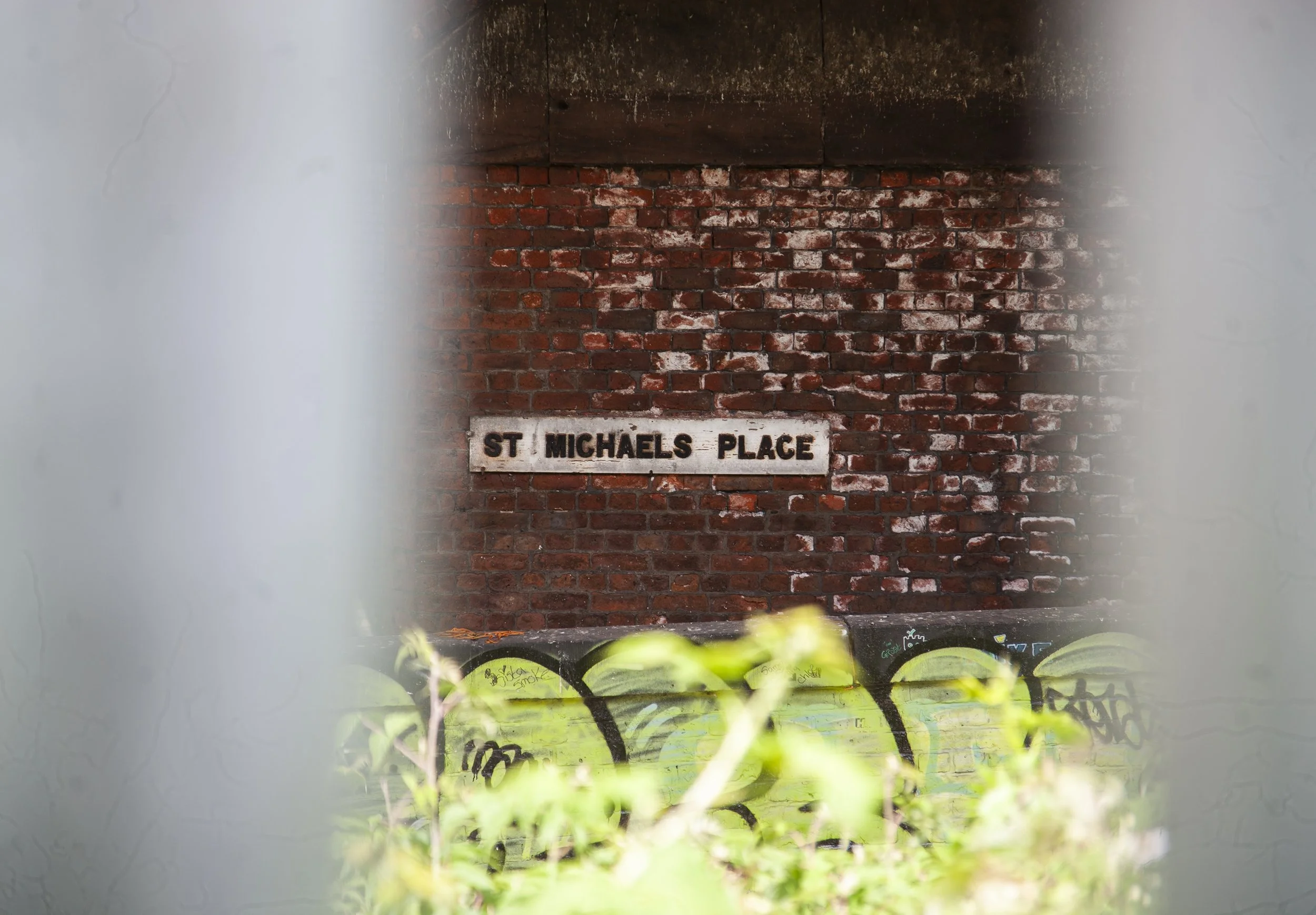
F37 Mancunio
Meet Mancunio, a new sans serif from F37 Foundry, inspired by one of the last original wooden street signs in Manchester. For its launch, F37 set Lingo and Office of Craig about creating a local ode to the city’s people and counterculture.
But while the typeface itself echoes Manchester’s deep history with a modern design sensibility – the copy introducing it was always going to get a deep level of sarcastic wit that is the Mancunian sensibility.
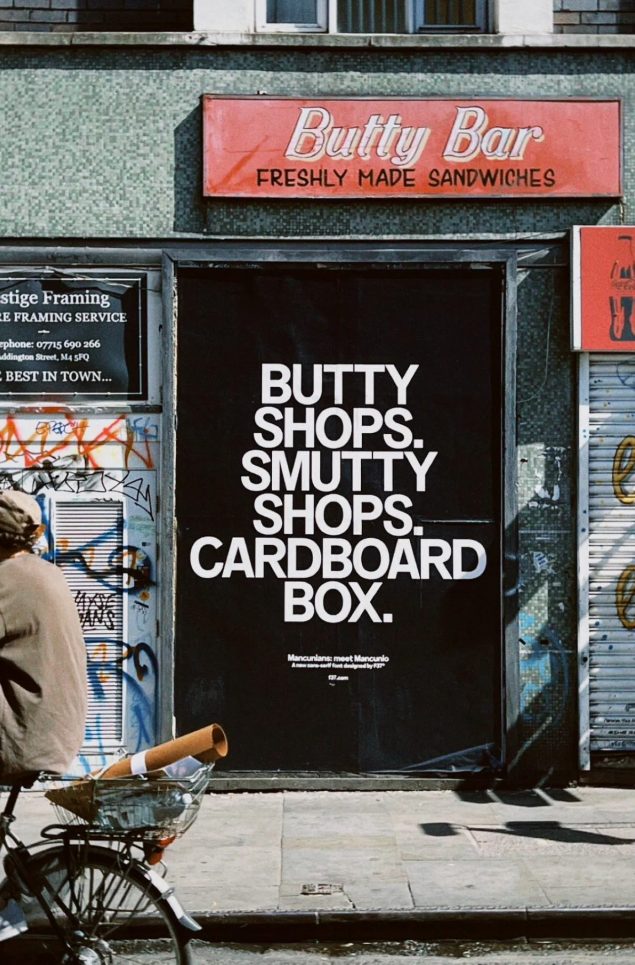
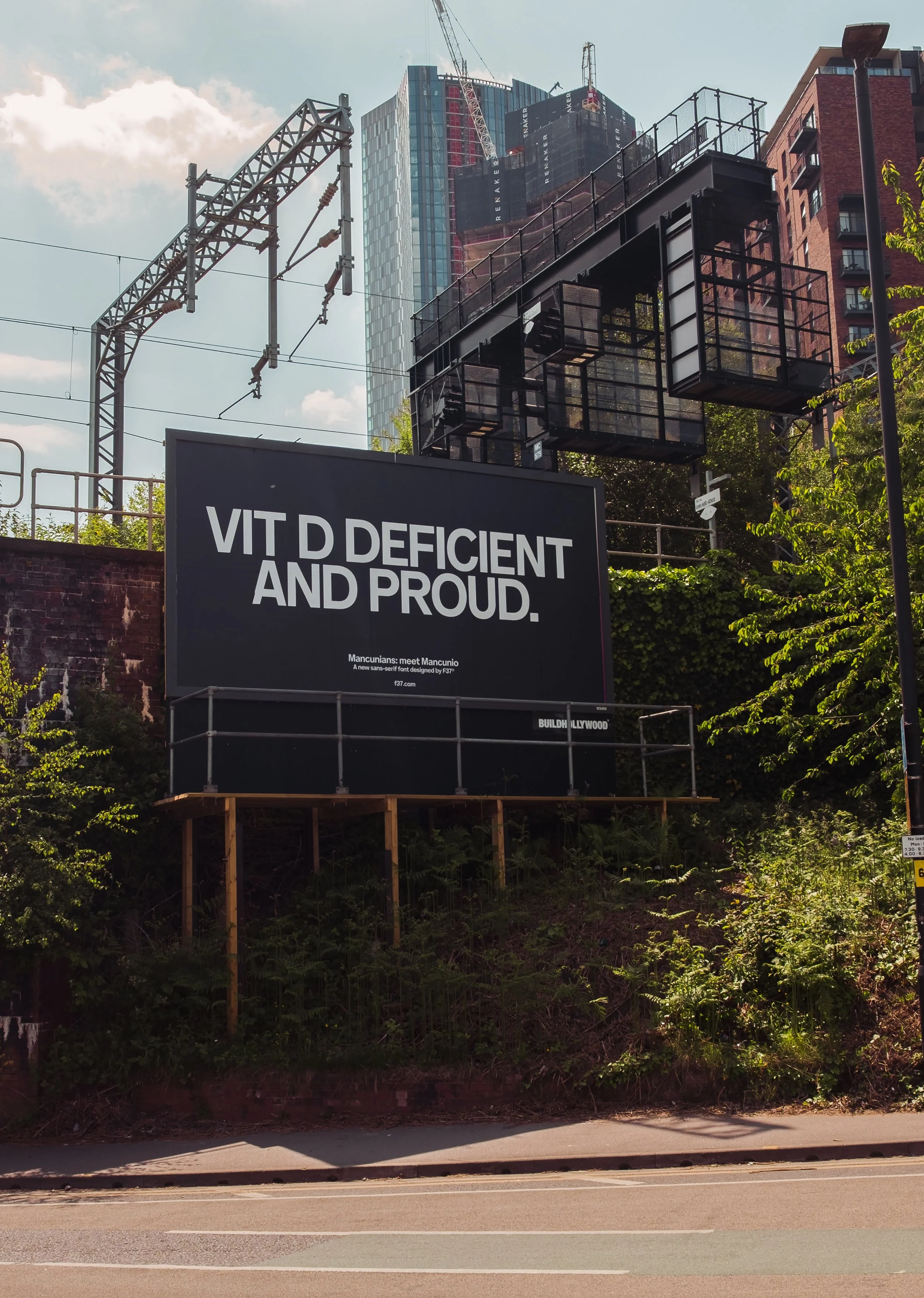
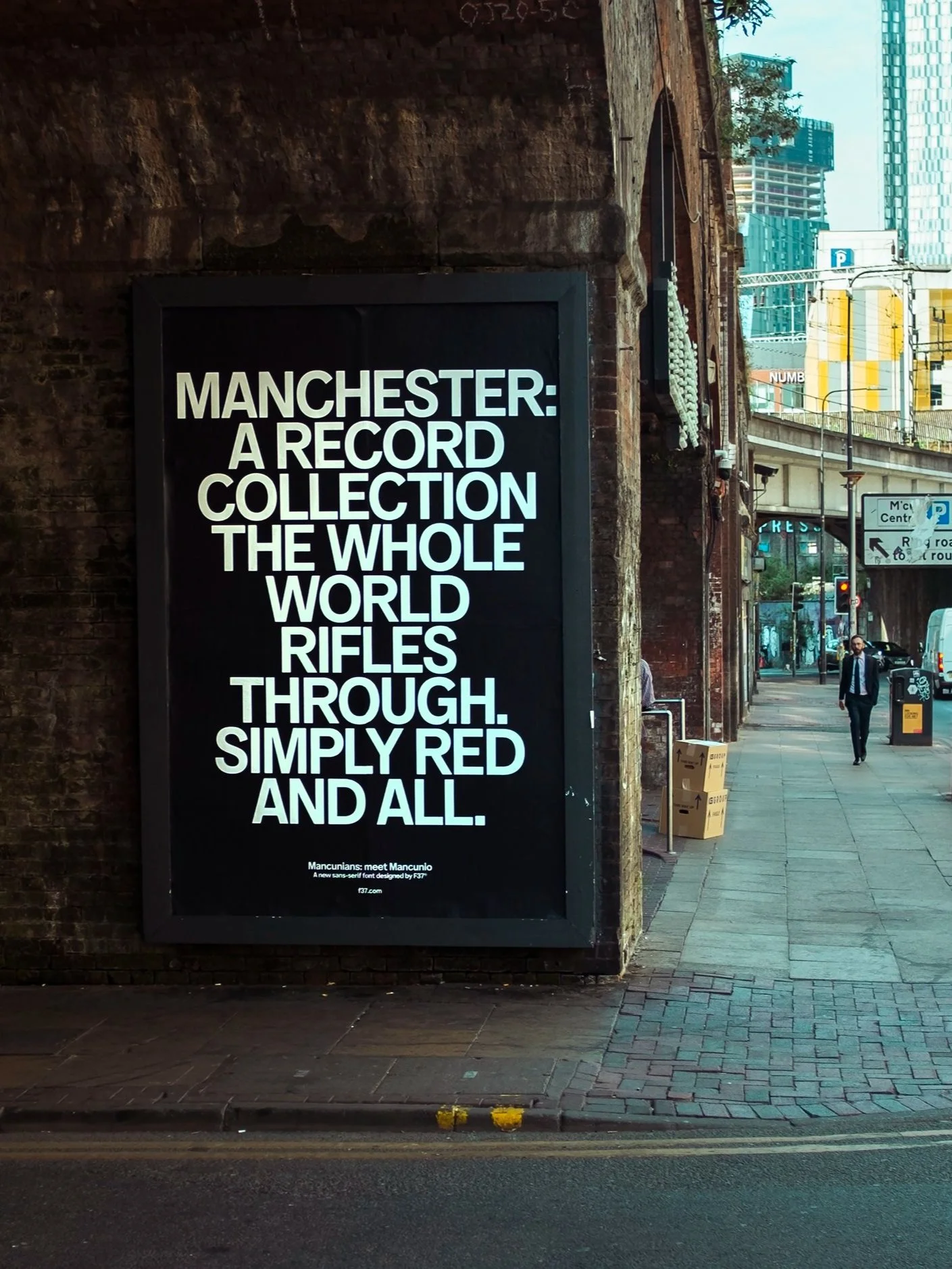
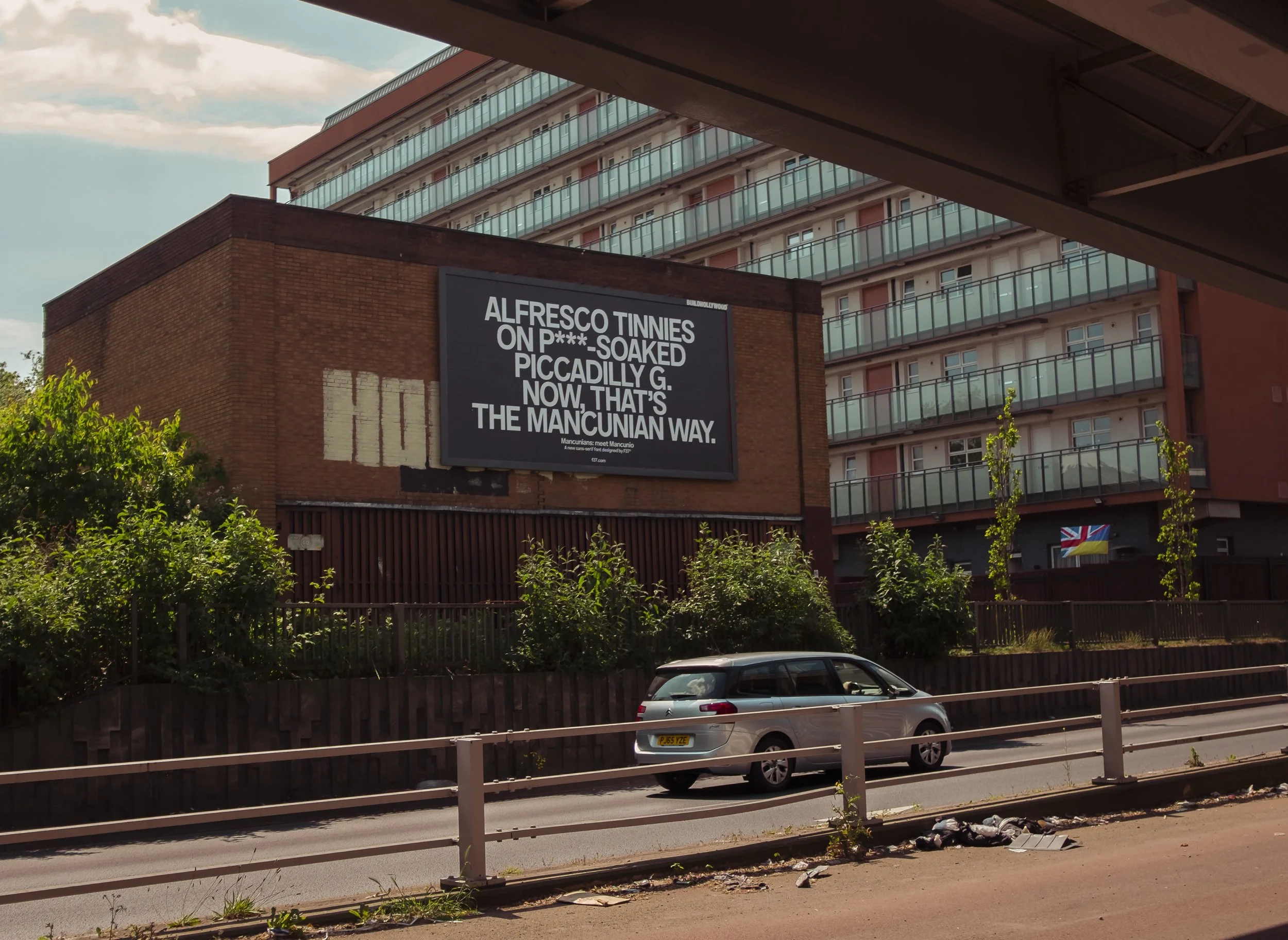
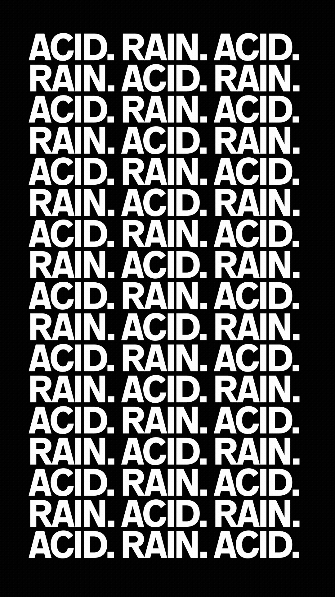
We had the OOH sites before I started writing, and the desire to be site-specific informed the whole direction for the print lines. Across the full campaign, I wanted to evoke the Manchester everyone really loves, and loves to hate. References you have to know to know, but also not shying away the tropes that truly represent the Manchester experience. This is Rain City (despite the heatwave we launched in, which I wasn’t expecting when I wrote ‘Vit D Deficient and Proud’).
Tony Wilson’s, ‘This is Manchester, we do things differently here’ makes its way to corporate murals here far too much IMO.
If you're from, or live up this way, you might cherish those words but share that thought. We were all clear from the off this was about adding a different fresh take, not just falling back on the halcyon days of Haçienda. And bees (revered as they are up here), were never getting near this.
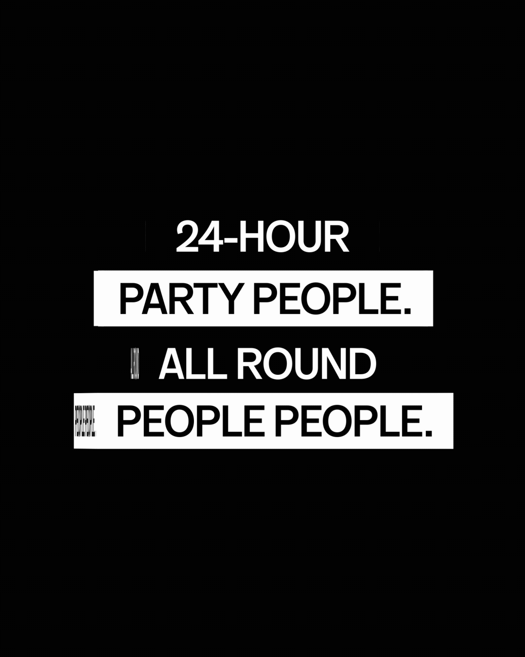
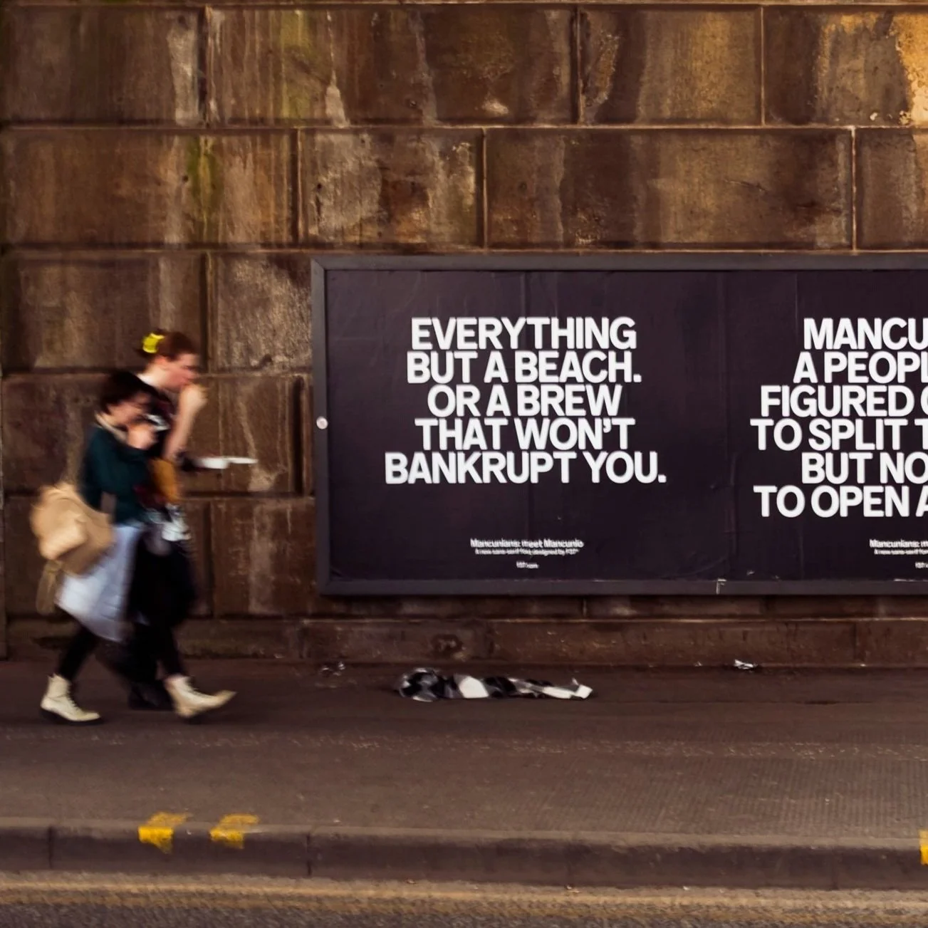
So, instead of parroting the most well-known Mancisms, I (lovingly) sent them up, turning the sarcastic Mancunian way on itself. And on the Sixth Day God Created MANchester’, became ‘If God Created Manchester, Satan Created Market St.’ Ian Brown’s ‘Everything Except a Beach’ quote became the perfect opportunity to lovingly roast our spenny coffee scene.

Irreverence is something of a house style for Lingo,
maybe that’s why I feel so at home here in Manchester.

I define the voice of Manchester as deeply sarcastic and defiantly optimistic. The combination of dry, deft wit and warmth is the tone I wanted to honour in our campaign for F37 Mancunio. Creating statements that celebrate the people and counterculture of Manchester, knowing they’d only do that themselves with a self-deprecating sense of pride.
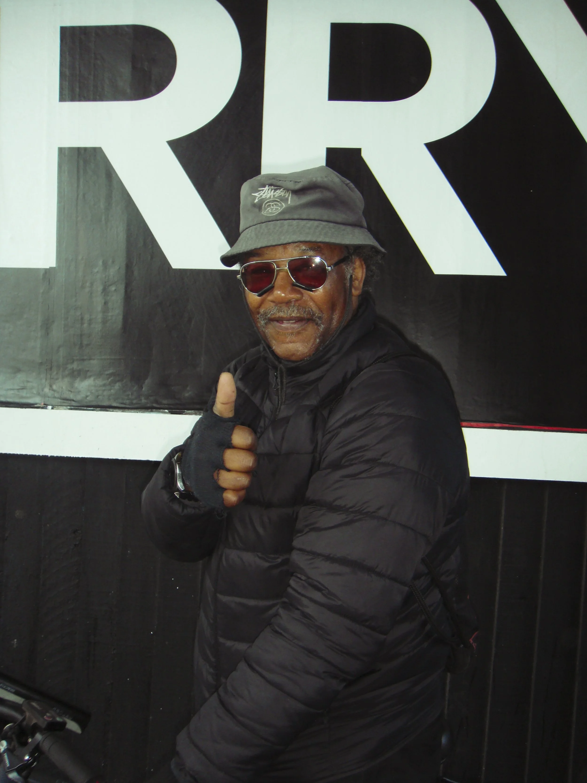
There are a couple of more earnest exceptions: We had to give the unofficial mascot of Manchester, Boombox Barry his flowers – in the form of a 96-sheet. And while nothing will replace ‘This Is The Place’, I wanted to add my version. In the midst of so-and-so is the new Berlin, Paris and so on, ‘Nowhere is the new Manchester’. It’s a one-off, not for reprint.

Credits
Client: Rick Banks, F37 Foundry
Design: Craig Oldham
Motion: Ste Townsend
Photography: Tim Sinclair
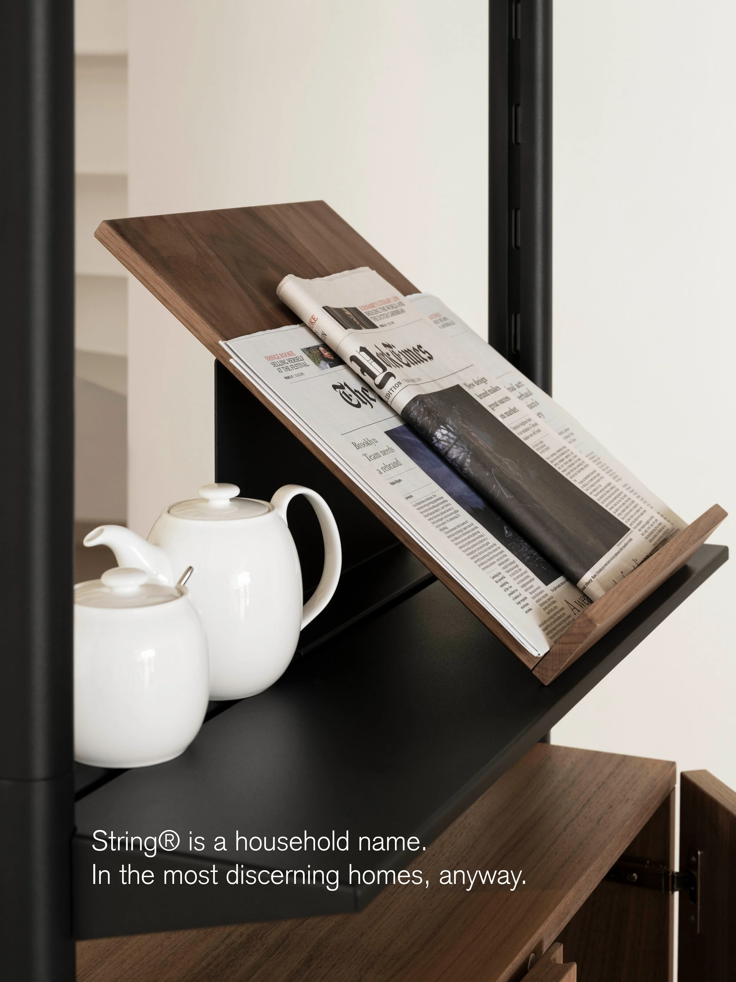
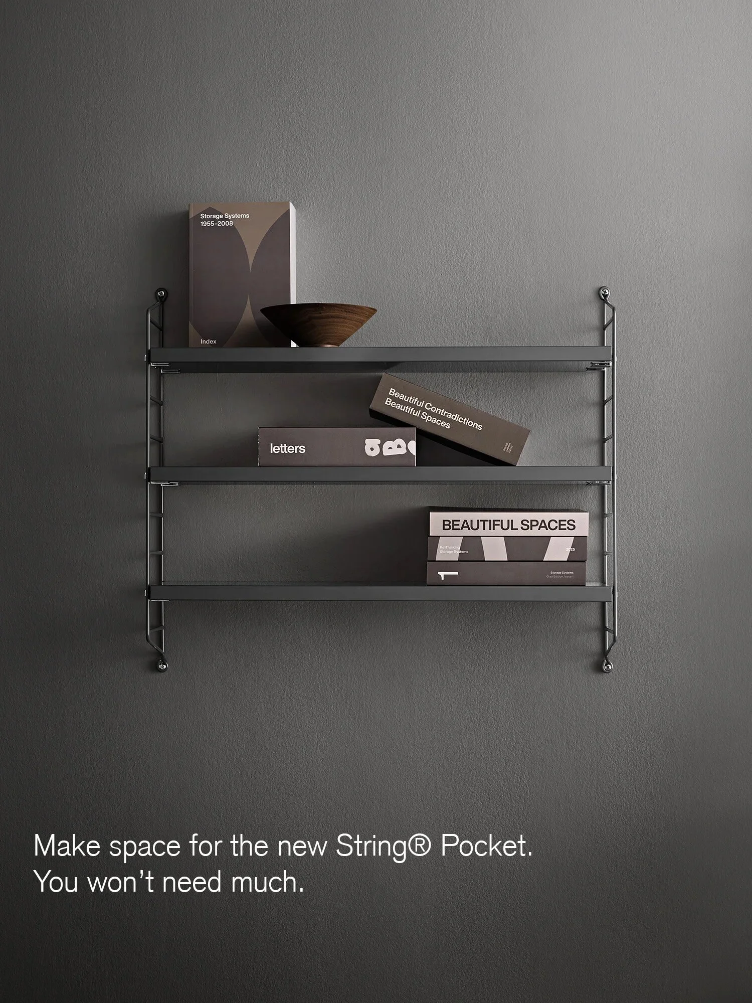
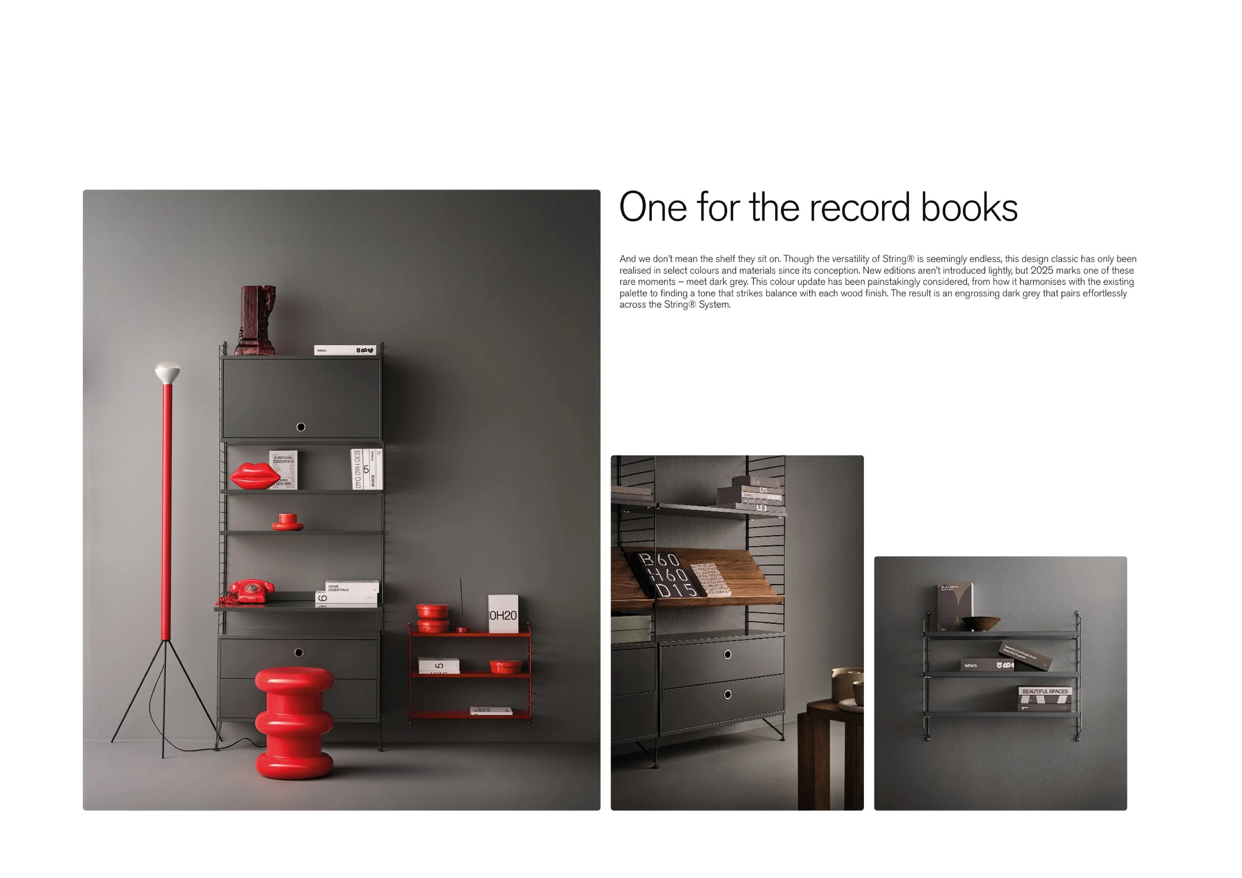
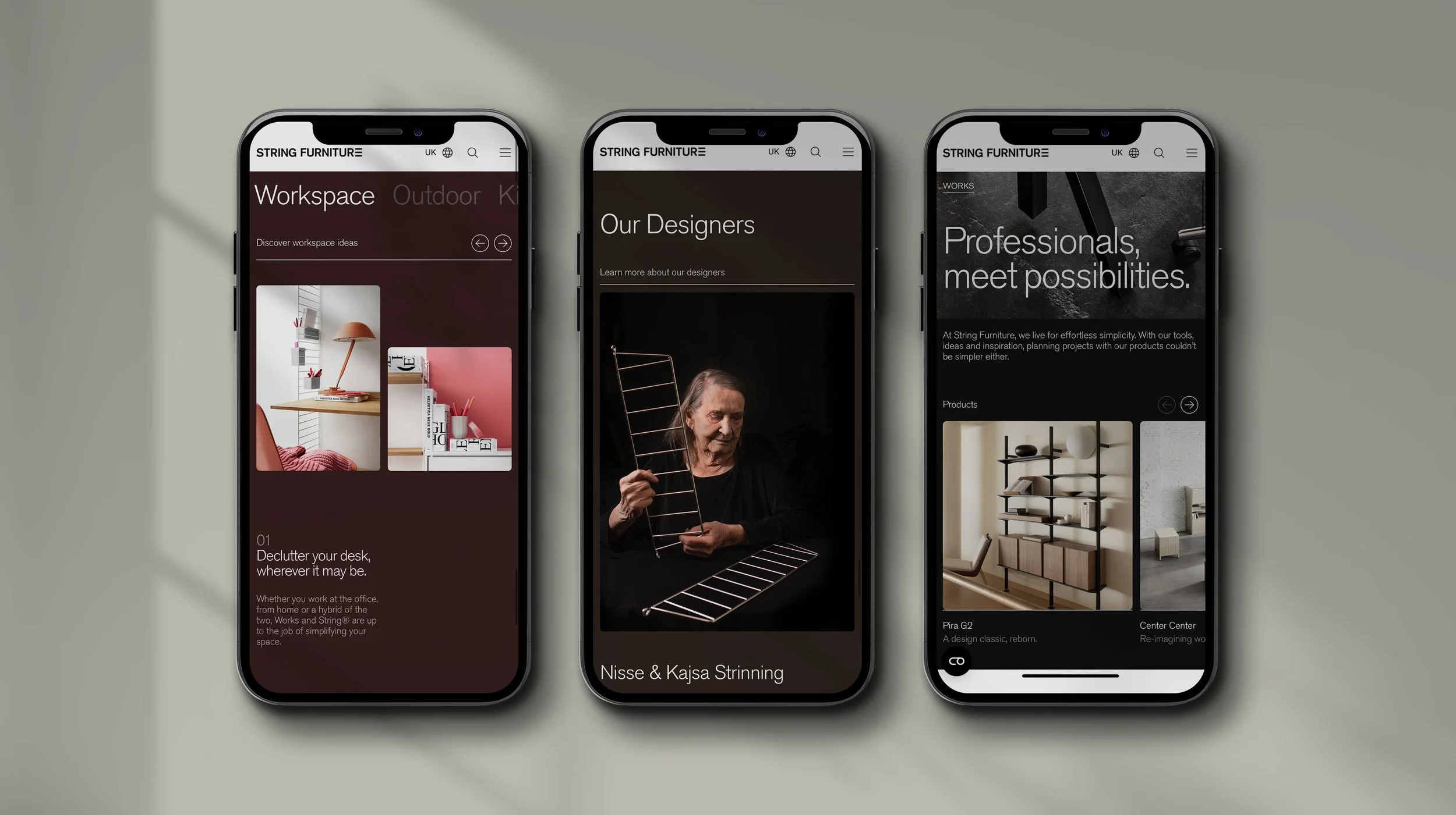
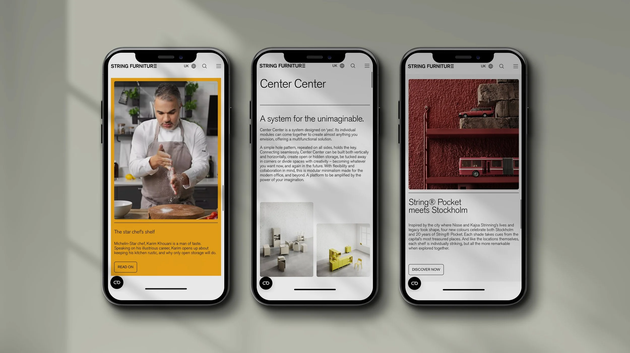
String Furniture
There are only 26 letters in the alphabet, and, just like String Furniture’s designs, the possibilities they create are endless. Working directly with the brand, I refined String Furniture’s tone of voice into a thing of beautiful simplicity, and allowing it to carry confidence befitting of a Scandinavian design icon.

When the moment’s right, which is often, String’s voice can be artfully offbeat too. Like (good) jazz.


Credits
String Furniture: Bo Hellberg & Malin Lovén
Site Design: GW Studio
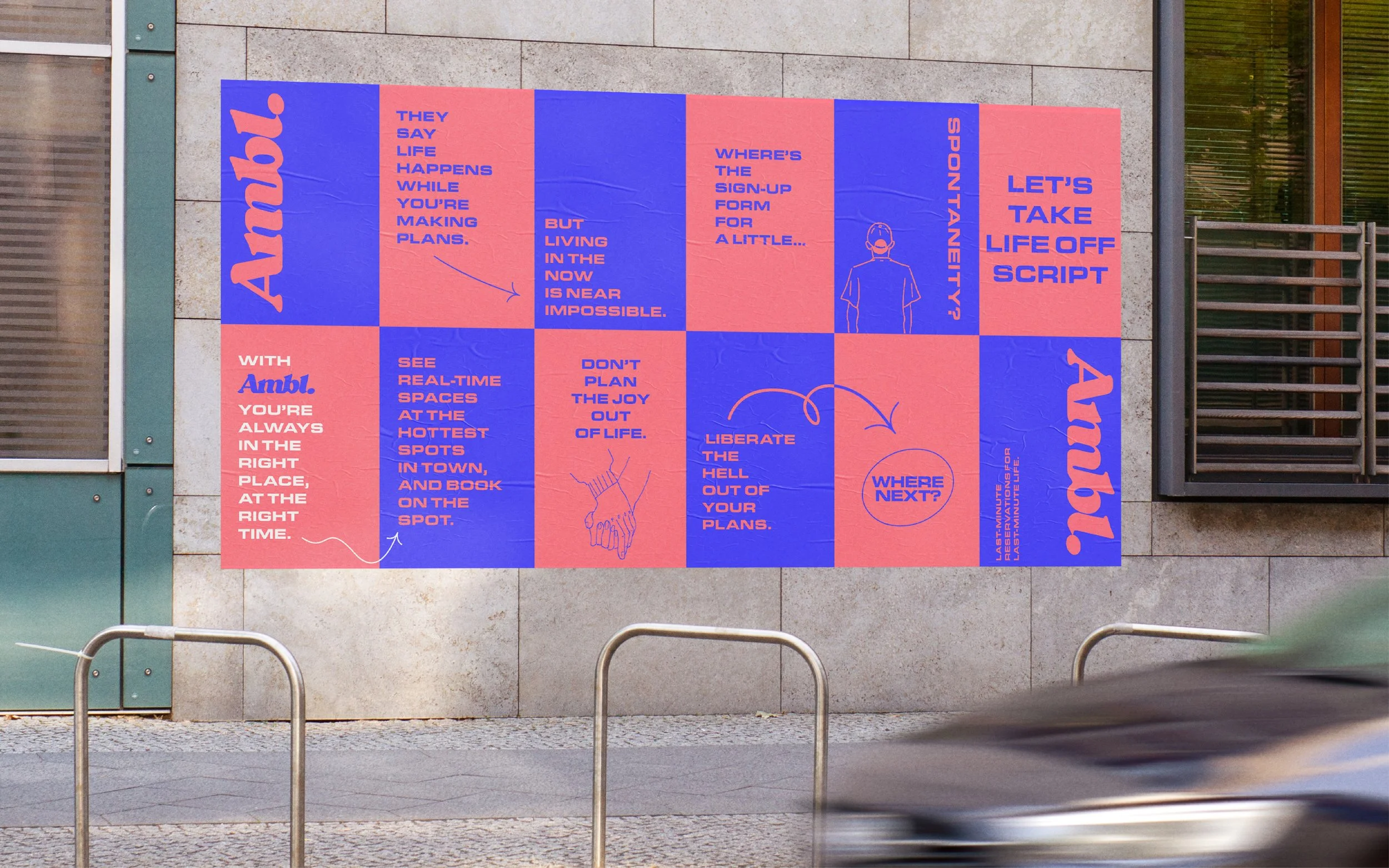
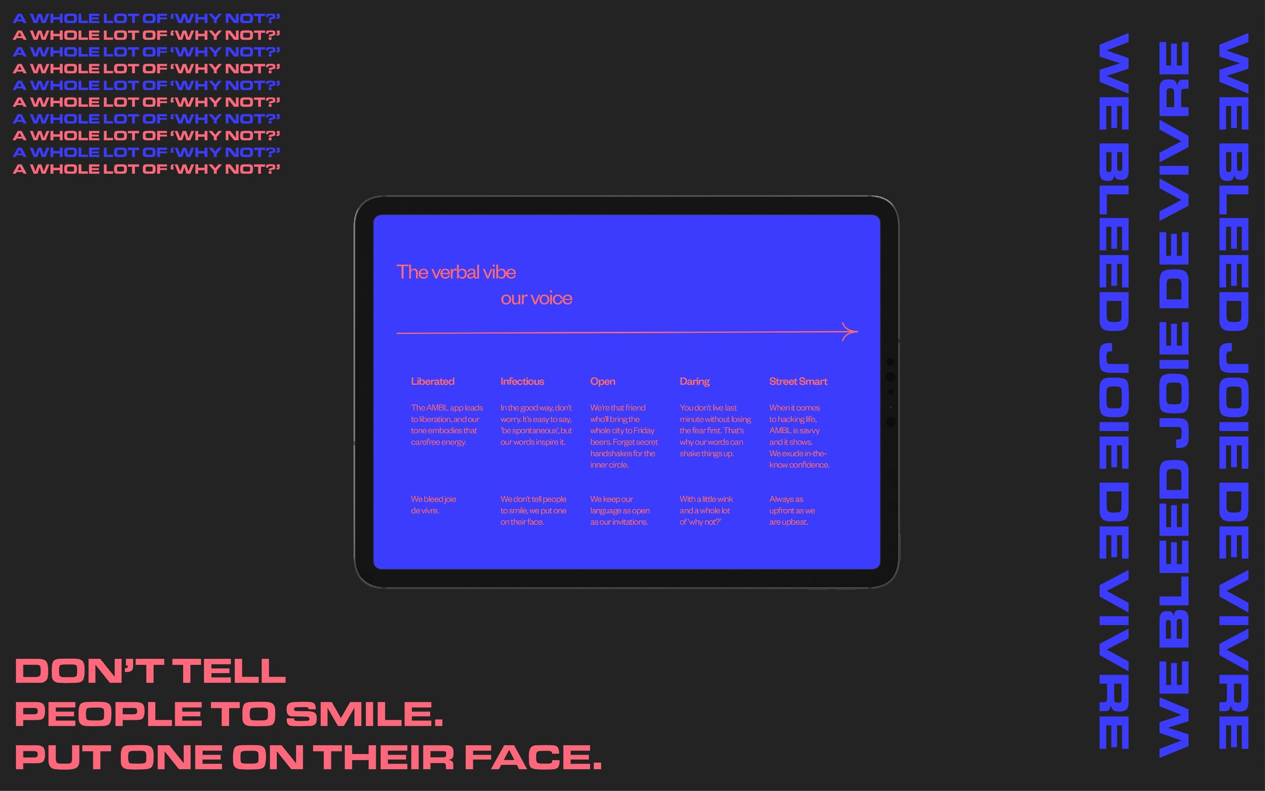
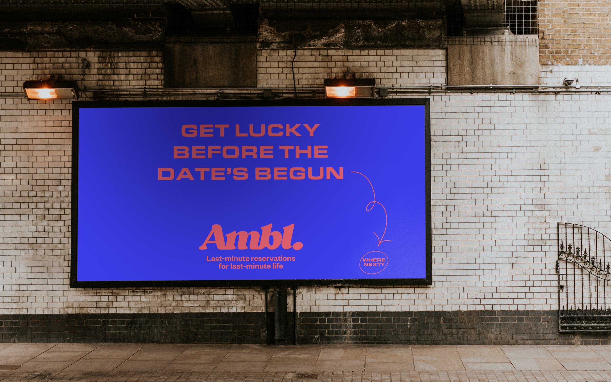
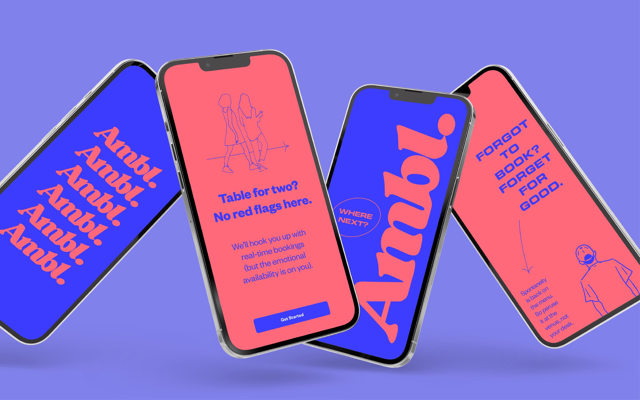
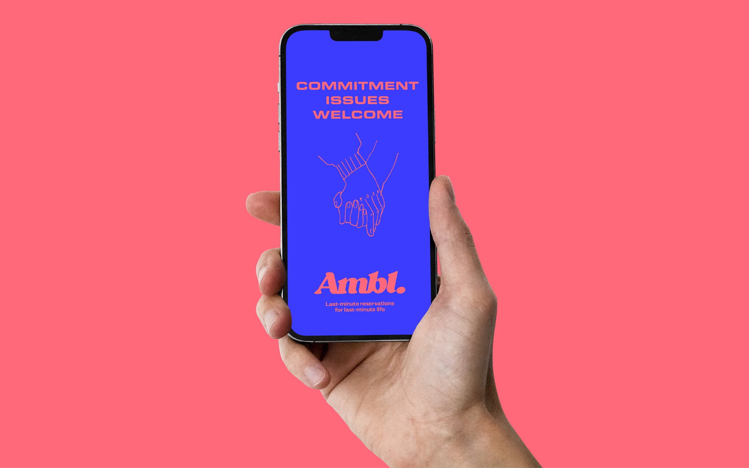
Ambl.
Agency: Unknown Article
Ambl is one of those nifty apps you can’t believe no-one thought of before. With a tap or two, it tells who which bars and restaurants have a table ready, right now. Making booking weeks in advance is a thing of the past.
But it doesn’t just remove friction from an archaic system, it unlocks the joy of a life less planned. This sense of liberation underpinned Unknown Article’s strategy for the brand, which Lingo came on board to bolster with a tone of voice that screams ‘The status quo has gotta go’.
Credits
Unknown Article: Mark Pavitt
Design & Illustration: Samuel Muir
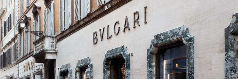
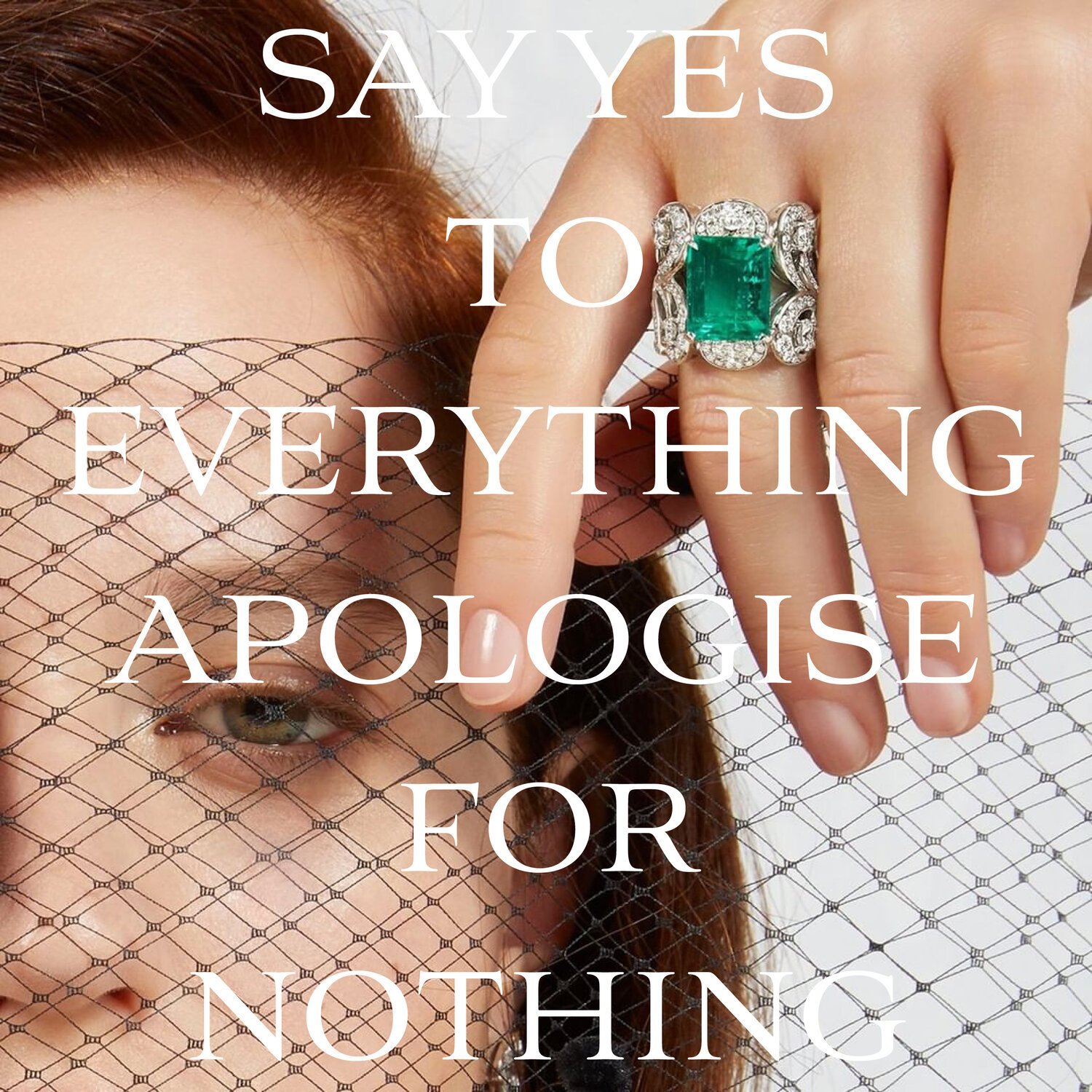
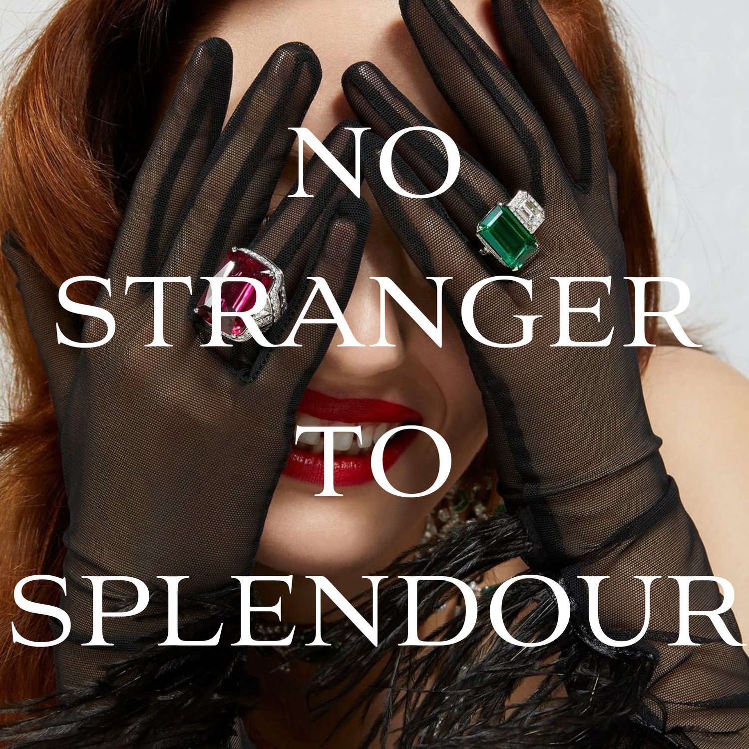
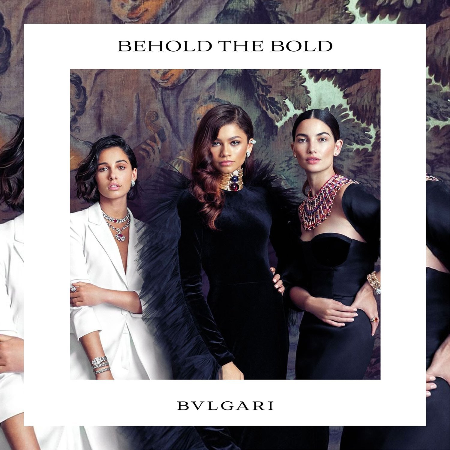
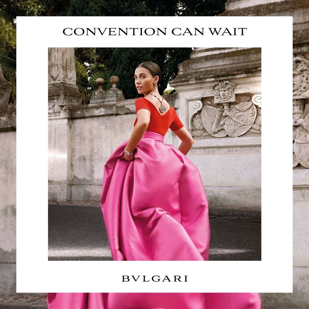
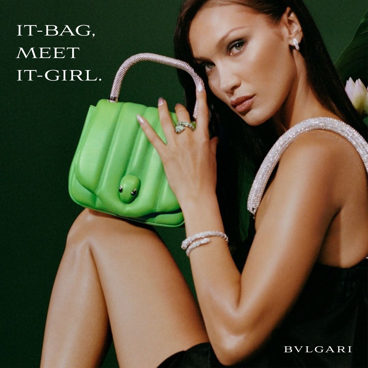
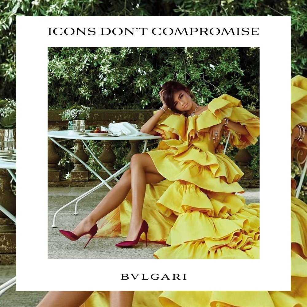
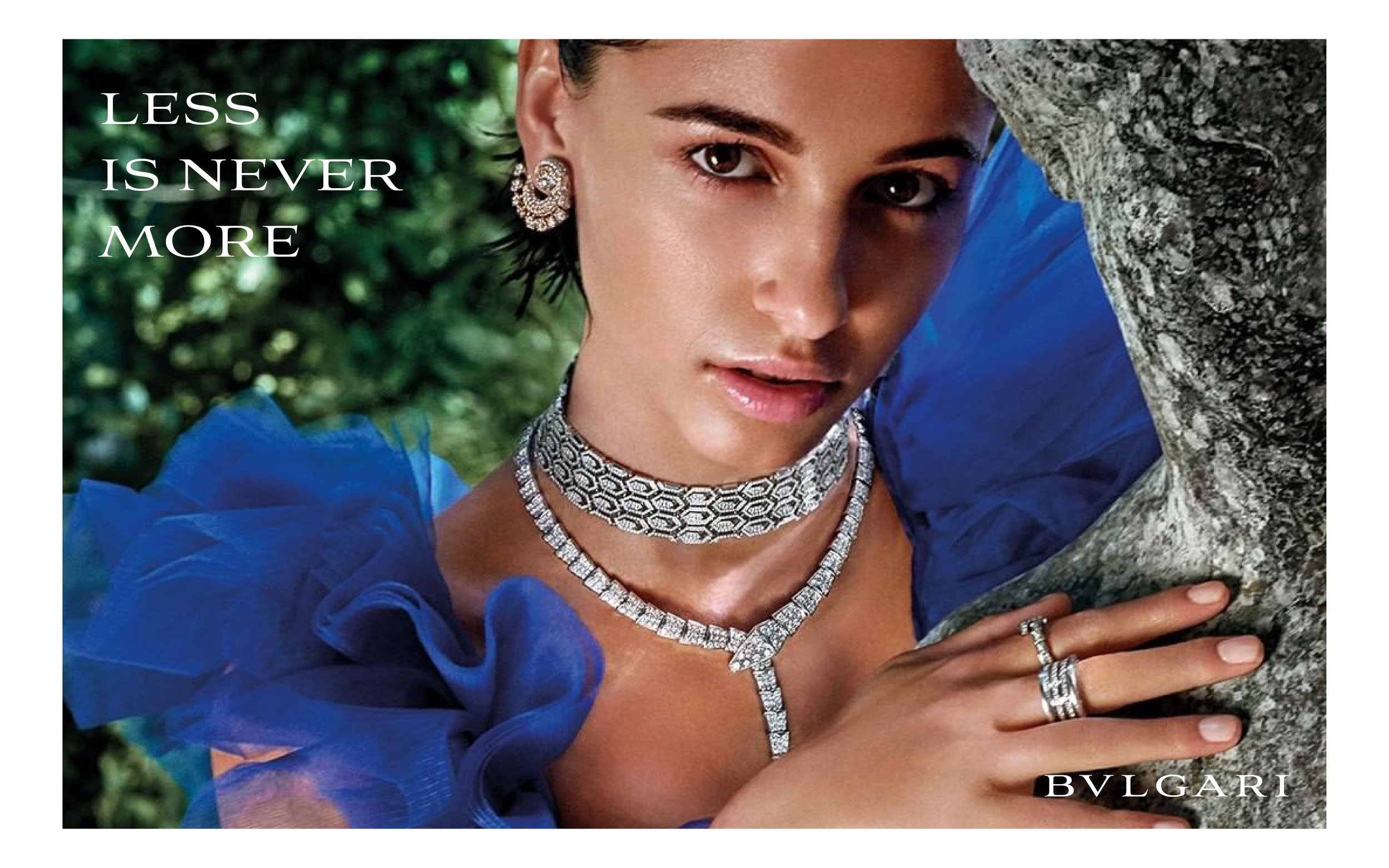
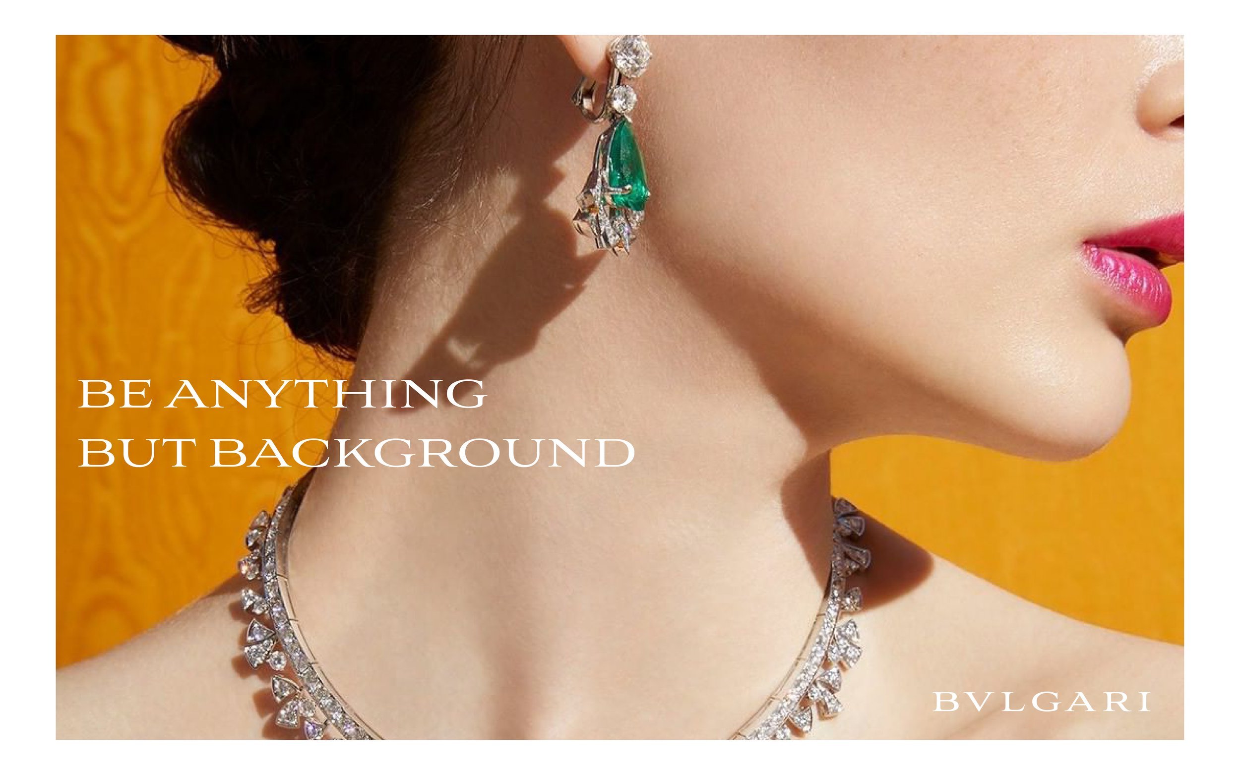
BVLGARI – Social Campaigns
Agency: AKQA
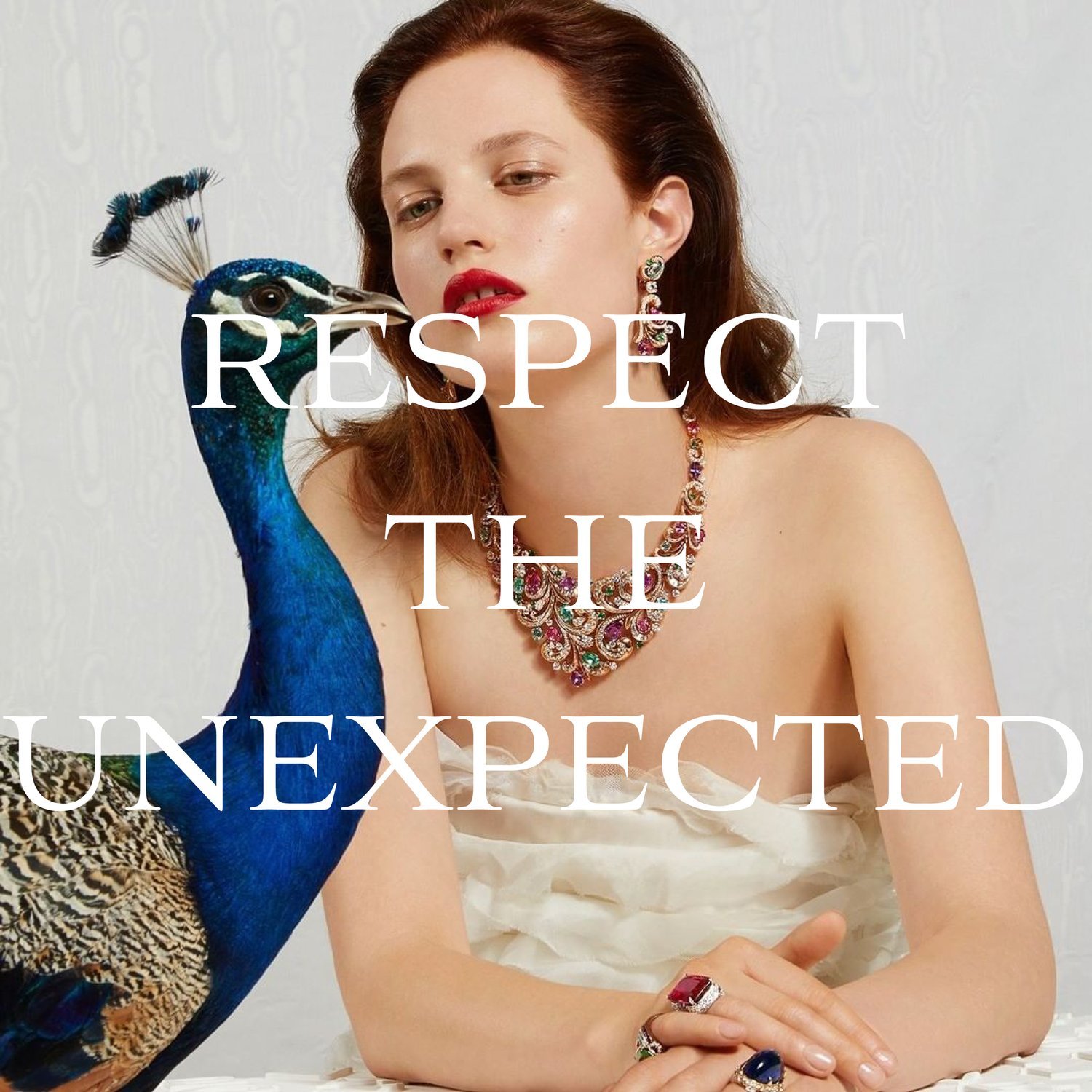
Rome’s enduring icon of luxury, Bvlgari, continues to dominate across the high jewellery, accessories and perfume categories. Leading the copy on Bvlgari social accounts for AKQA, Lingo defined how each strand of the brand shone online.
From sharing the master Maison’s exuberant Roman roots, to spotlighting opulent products and launching decadent new lines, bringing Bvlgari’s infamous presence to fruition was a Herculean journey through the thesaurus.


Credits
AKQA: Vitor Forte & Jasmina Wood
Social Copywriter: Ellen Ling
📸: Bvlgari
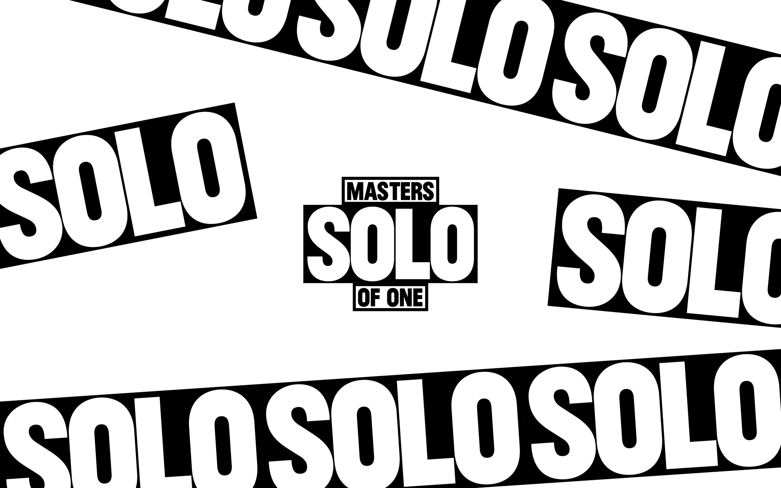
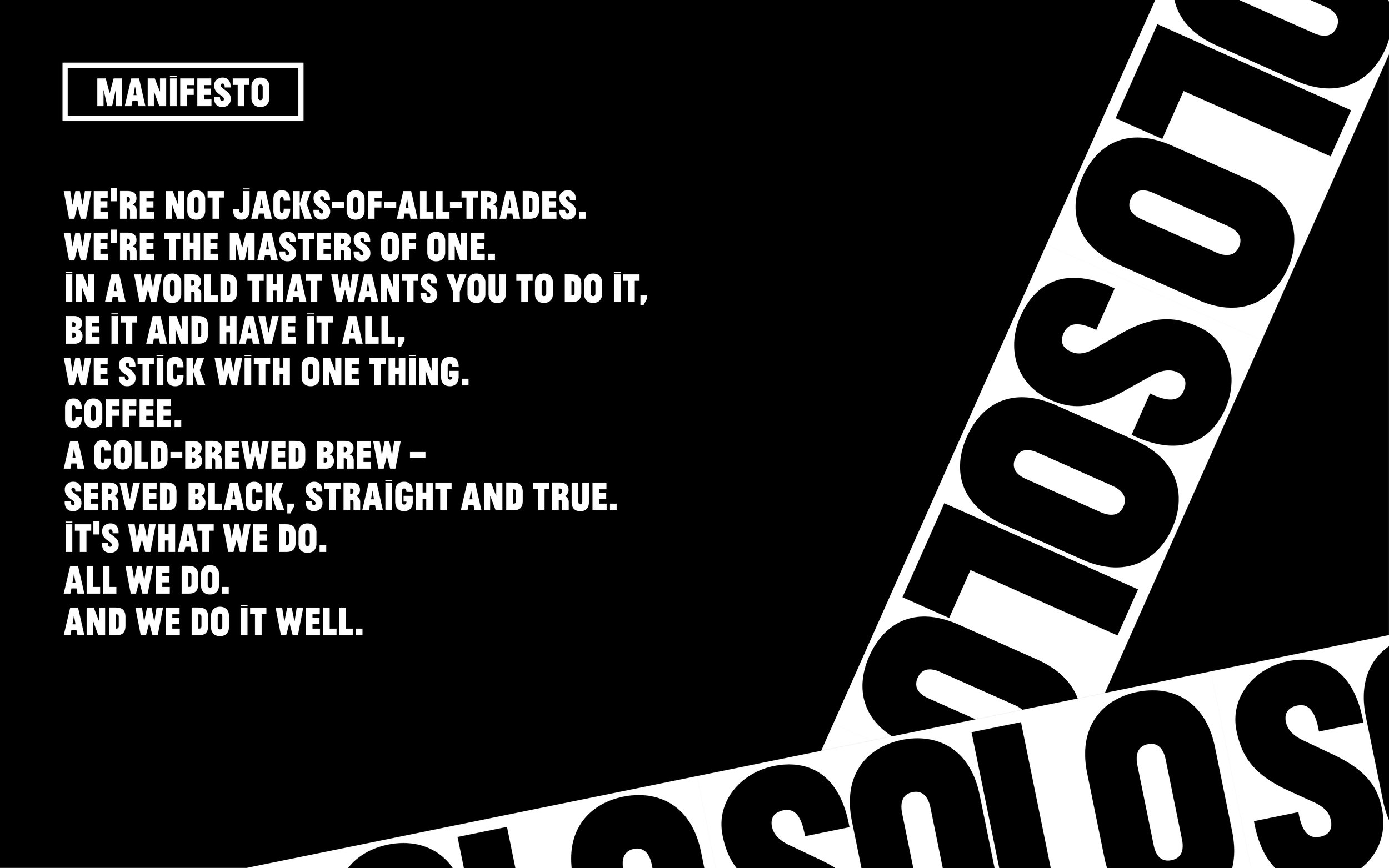
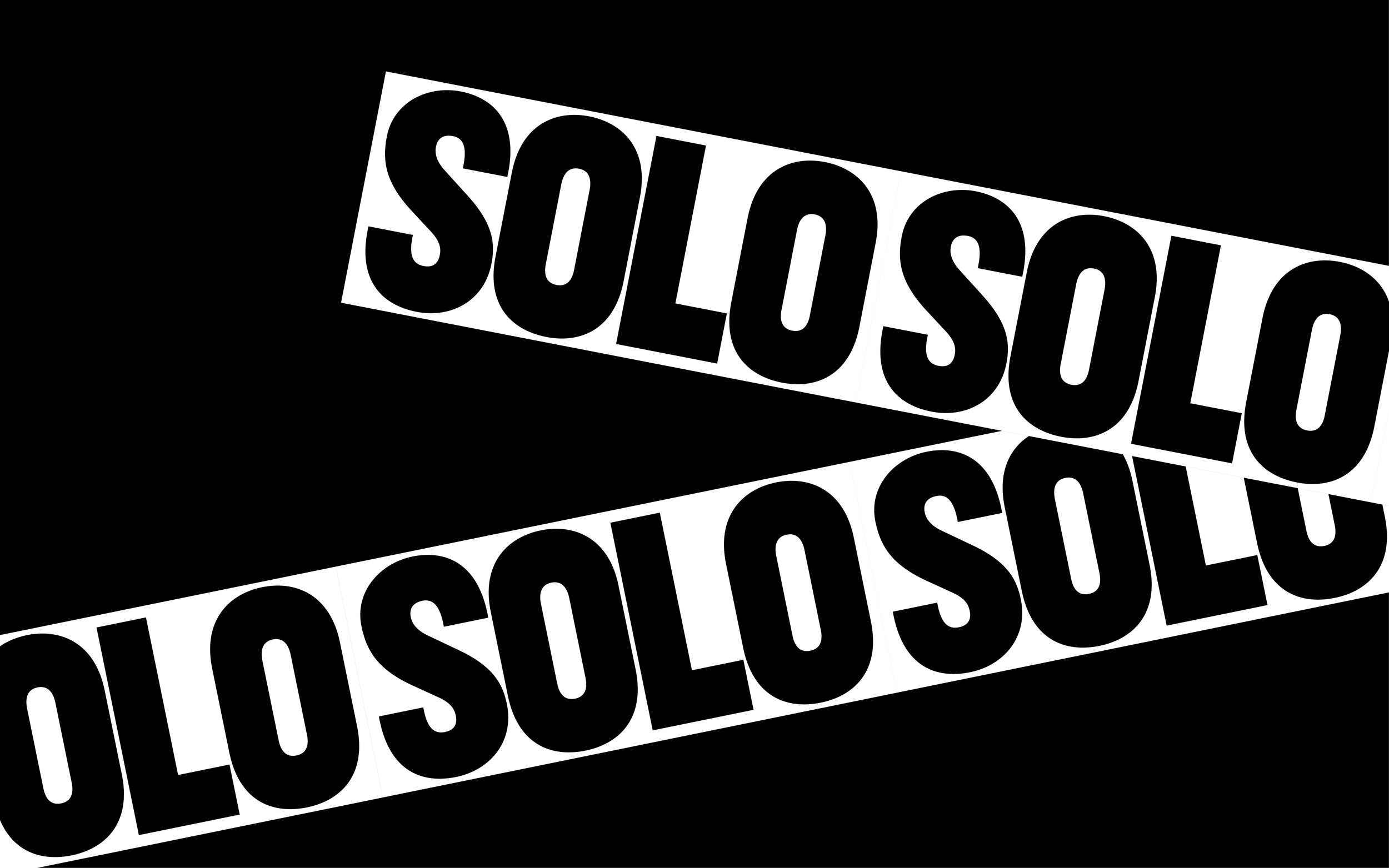
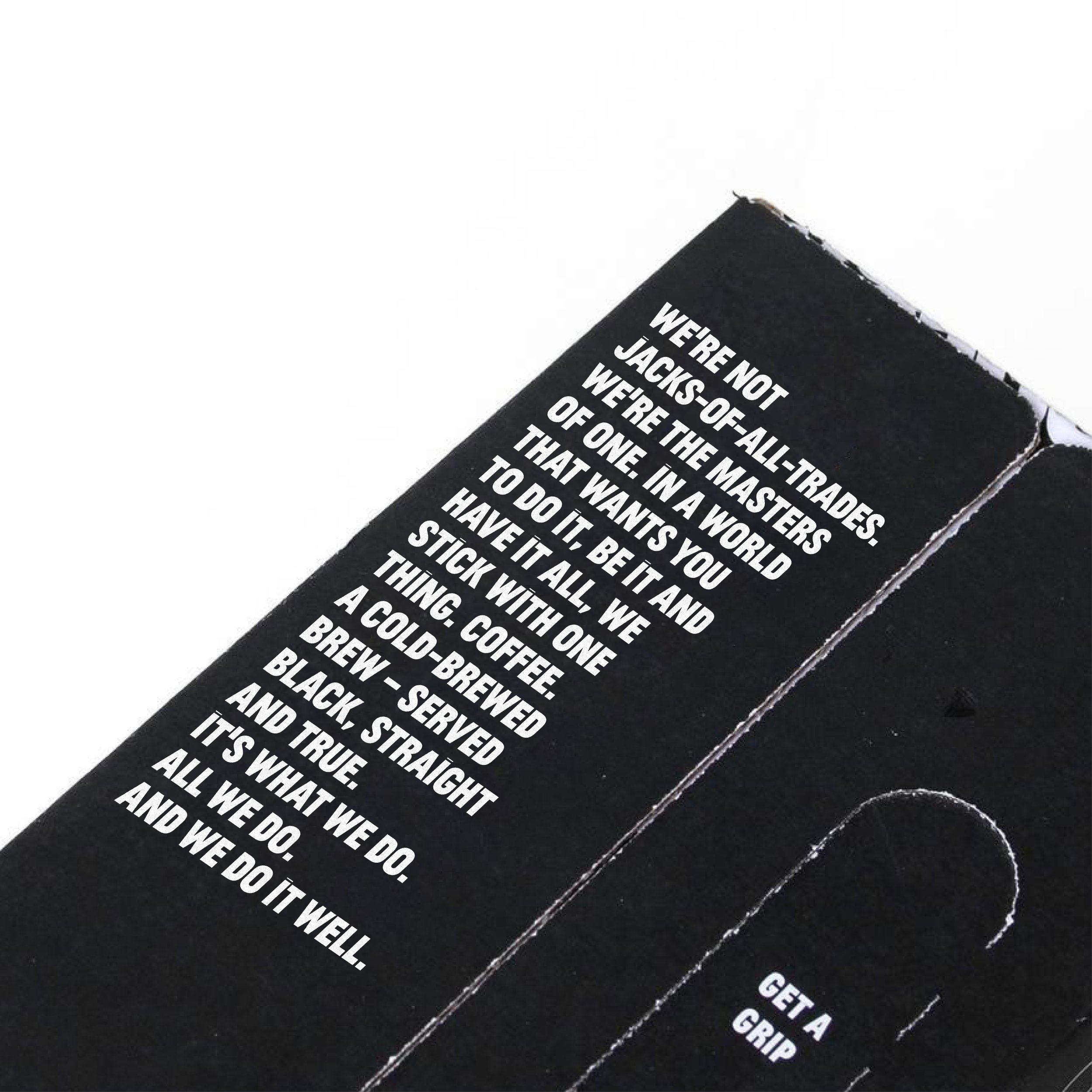
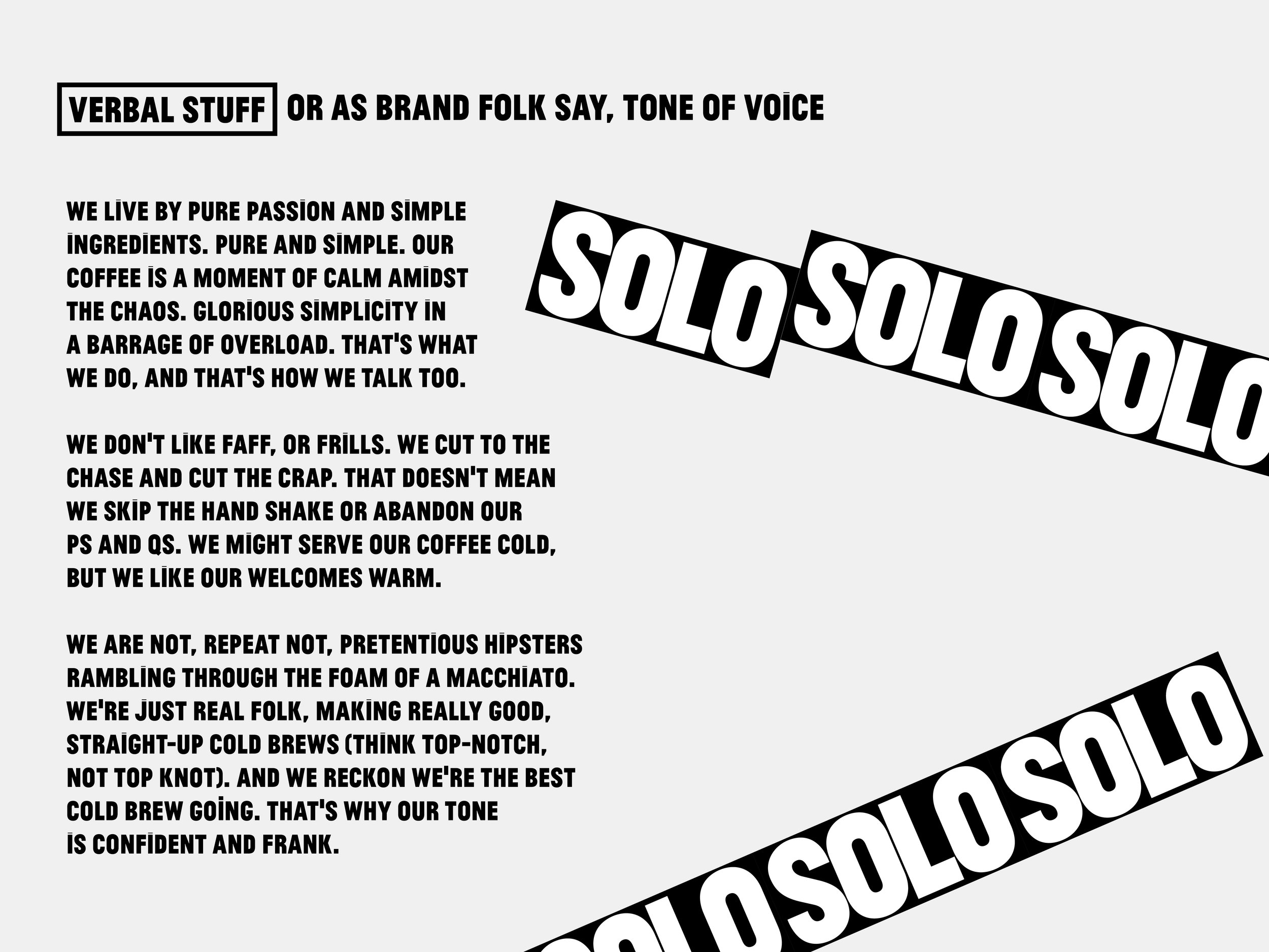
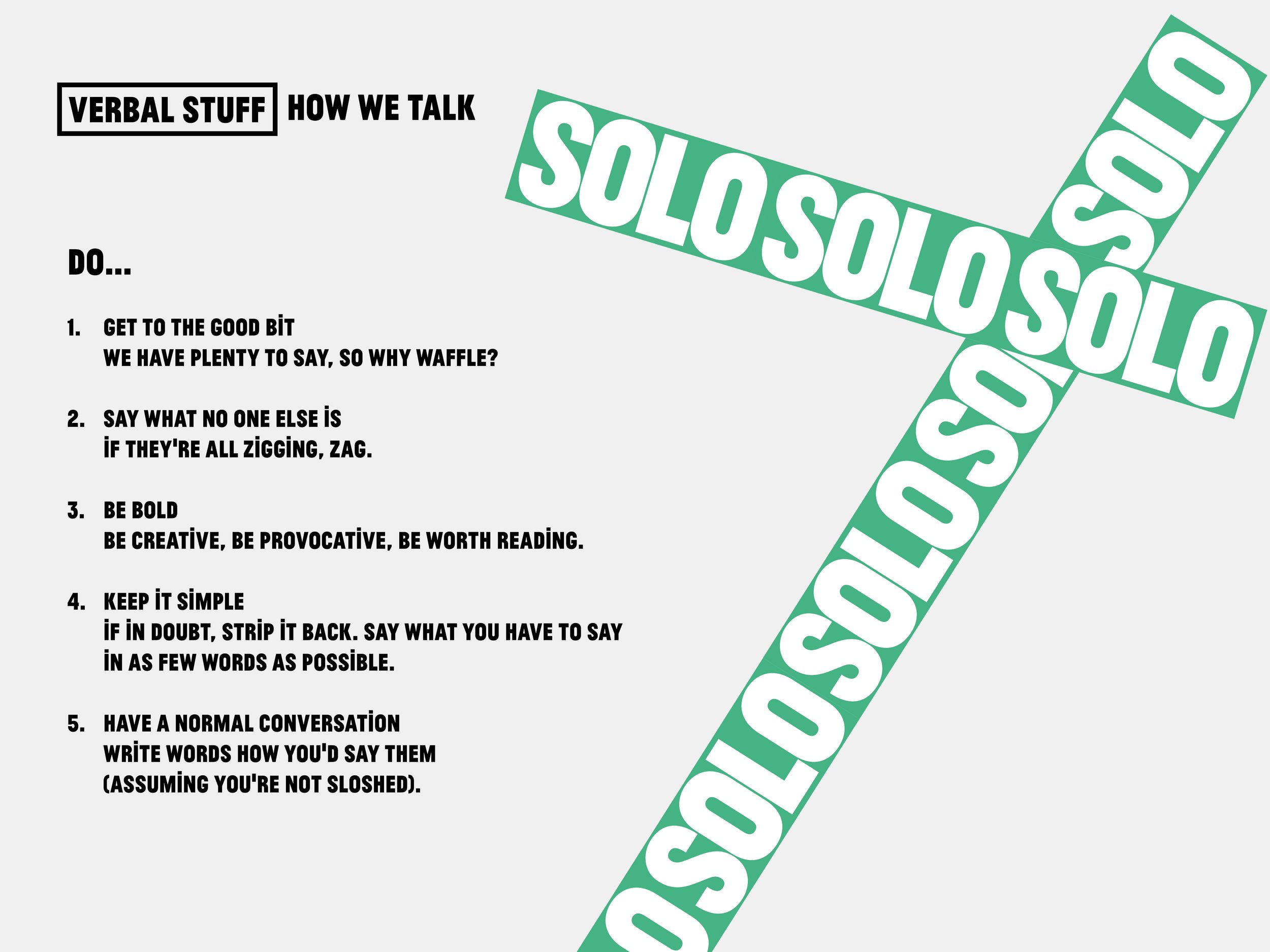
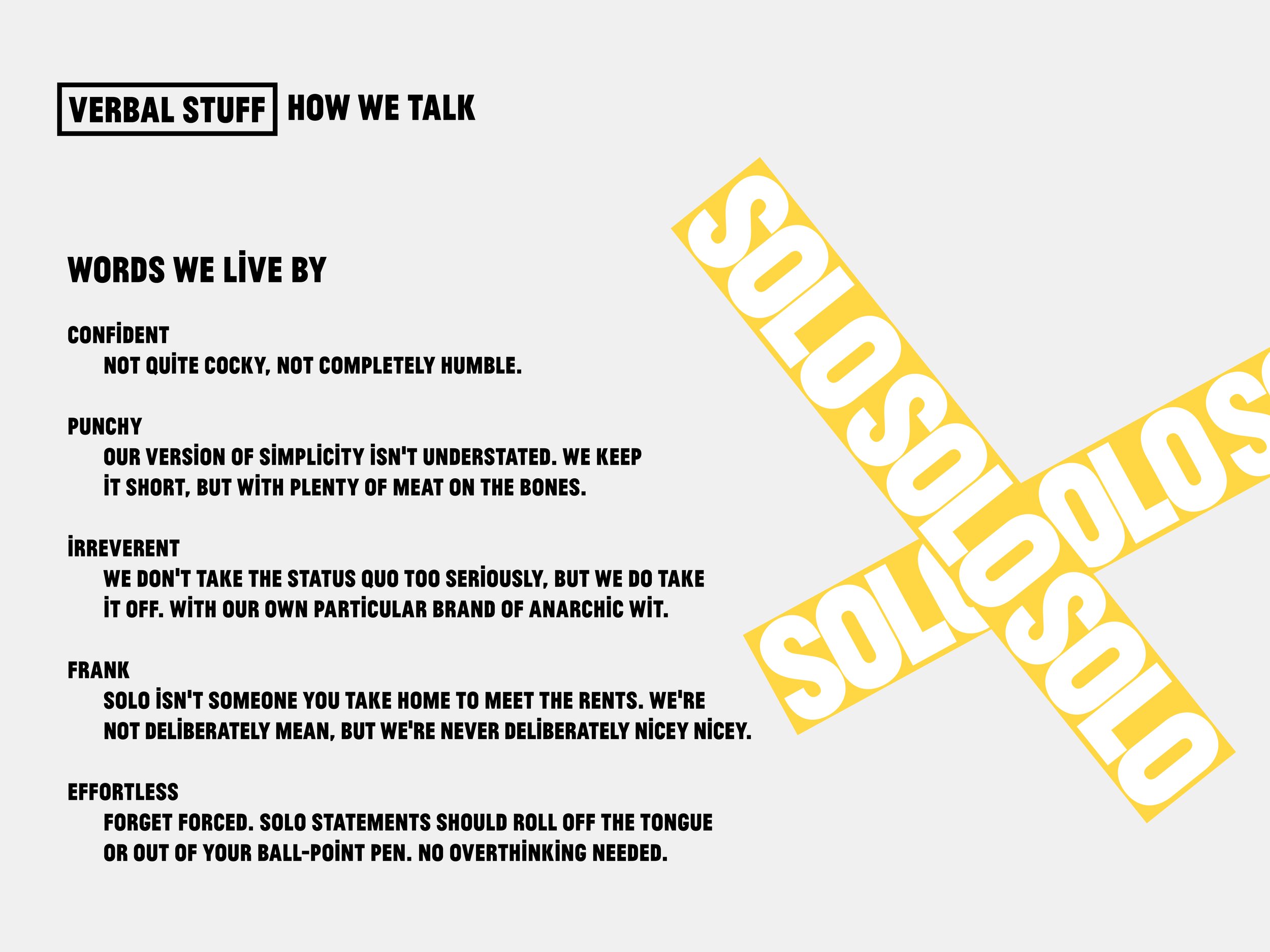
SOLO – Cold-Brew Coffee
Agency: Umbrella
Take one logo (designed by Anthony Burrill), add a visual identity (brought to you by Craig Oldham) and what do you have? A start-up coffee venture waiting on one copywriter to make it a fully-fledged brand. Lingo teamed up with the aforementioned fellas to bring SOLO to life with words.
With an anti-hipster positioning, distinctly un-wanky tone of voice, and pithy values behind them, SOLO cold brew could stand well and truly apart from the beardy craft crowd.


Credits
Logo: Anthony Burril
Design: Craig Oldham
Copywriter: Ellen Ling
Additional Direction: Tansy Drake, Tash Peskin, Tim Fowler

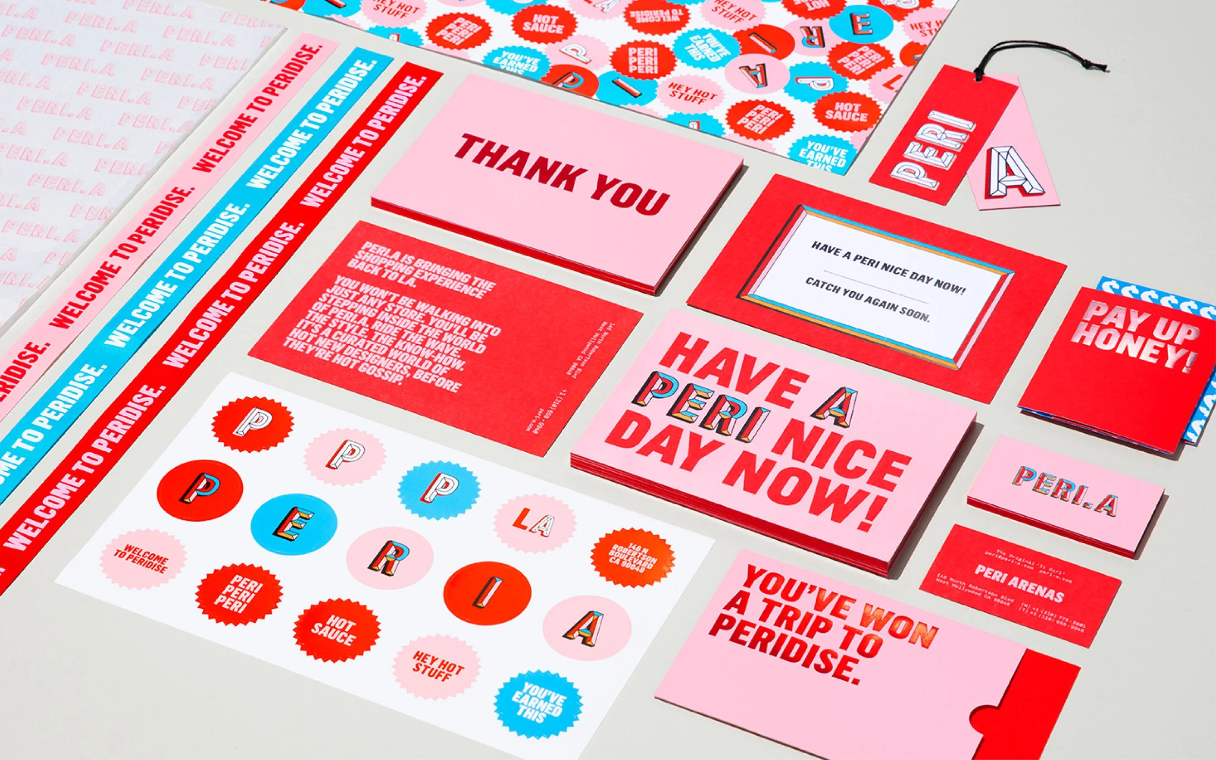
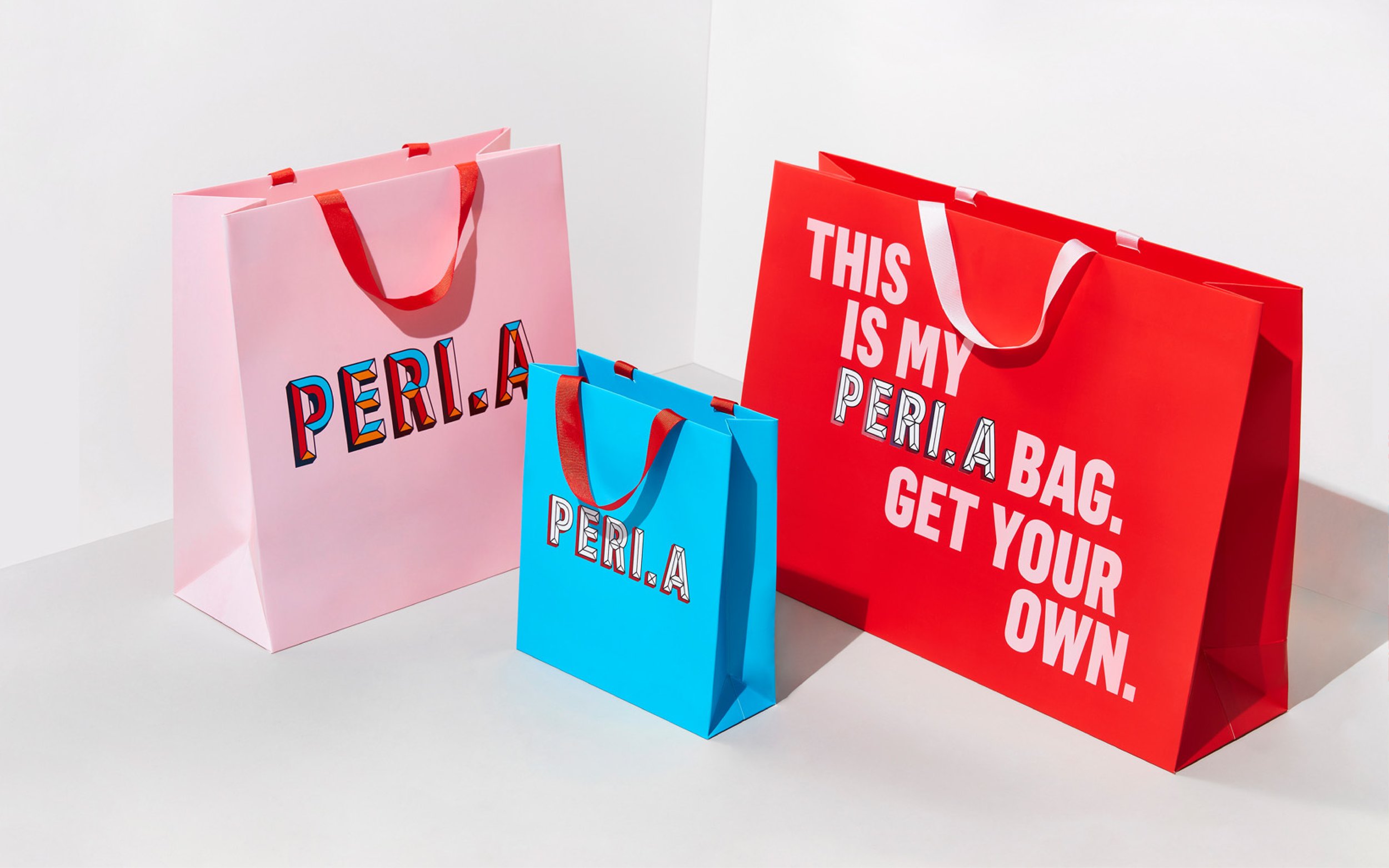
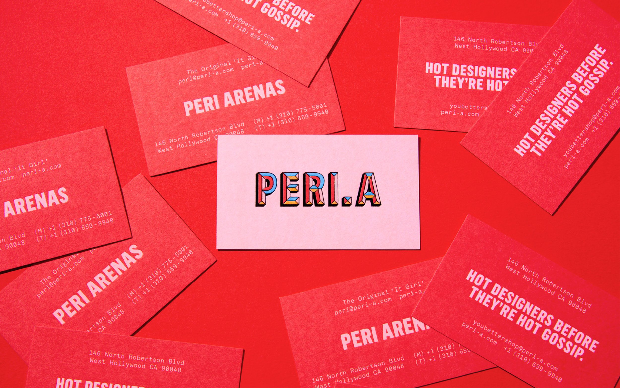
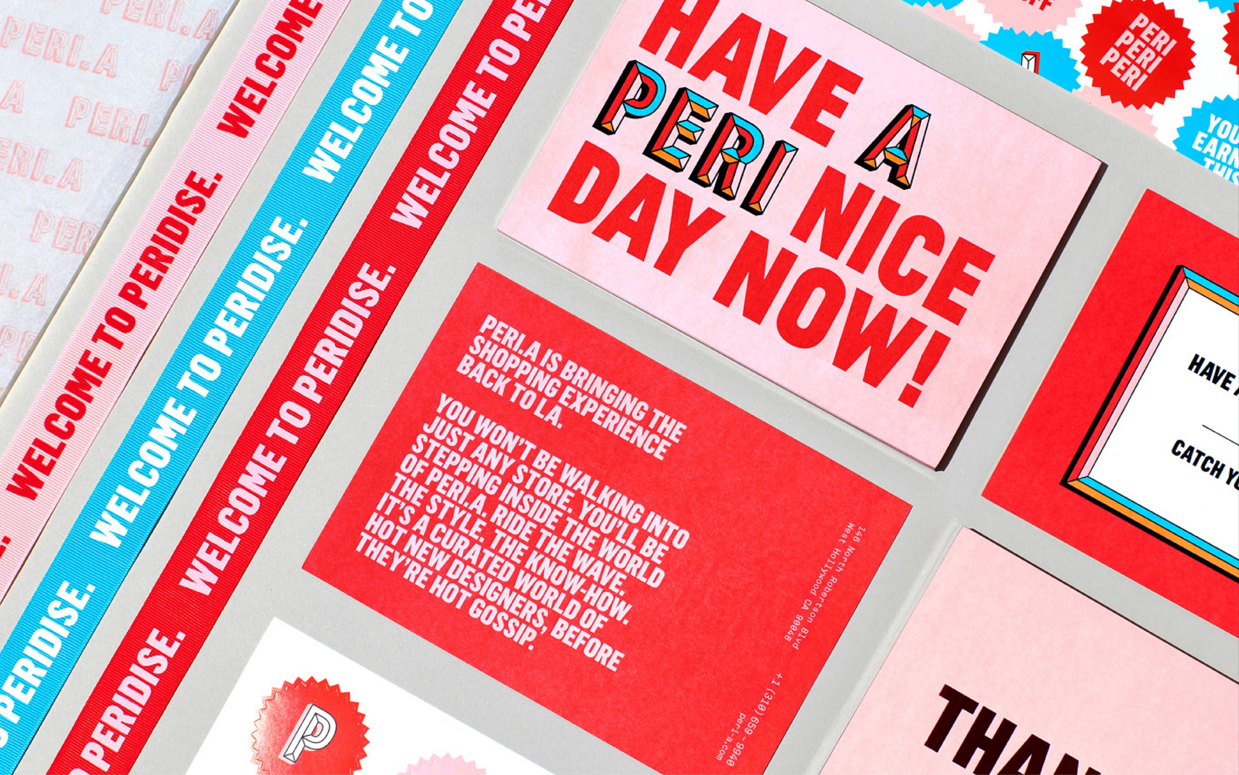
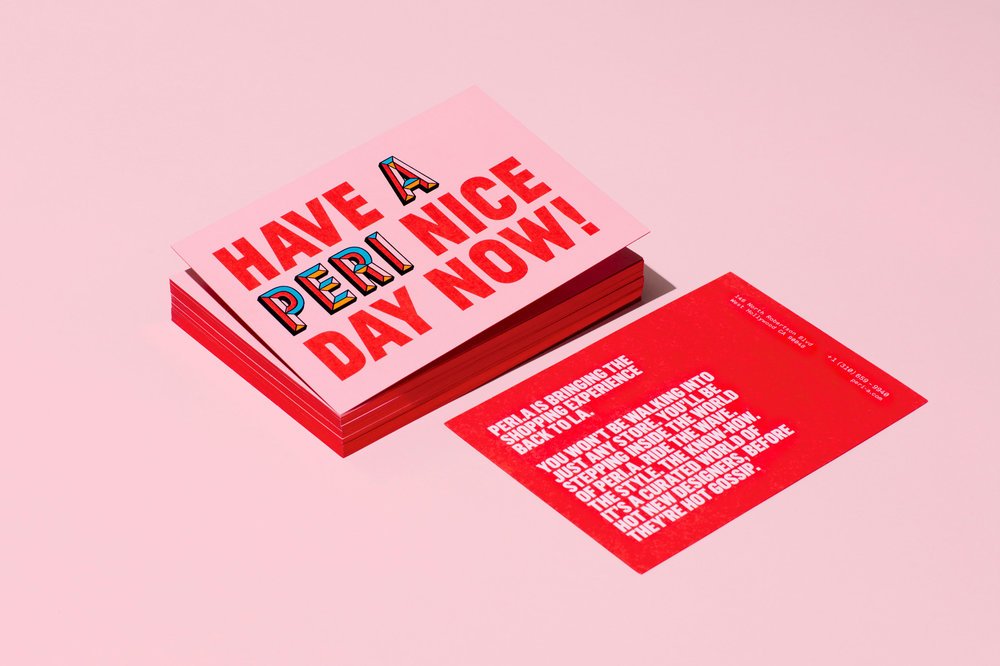
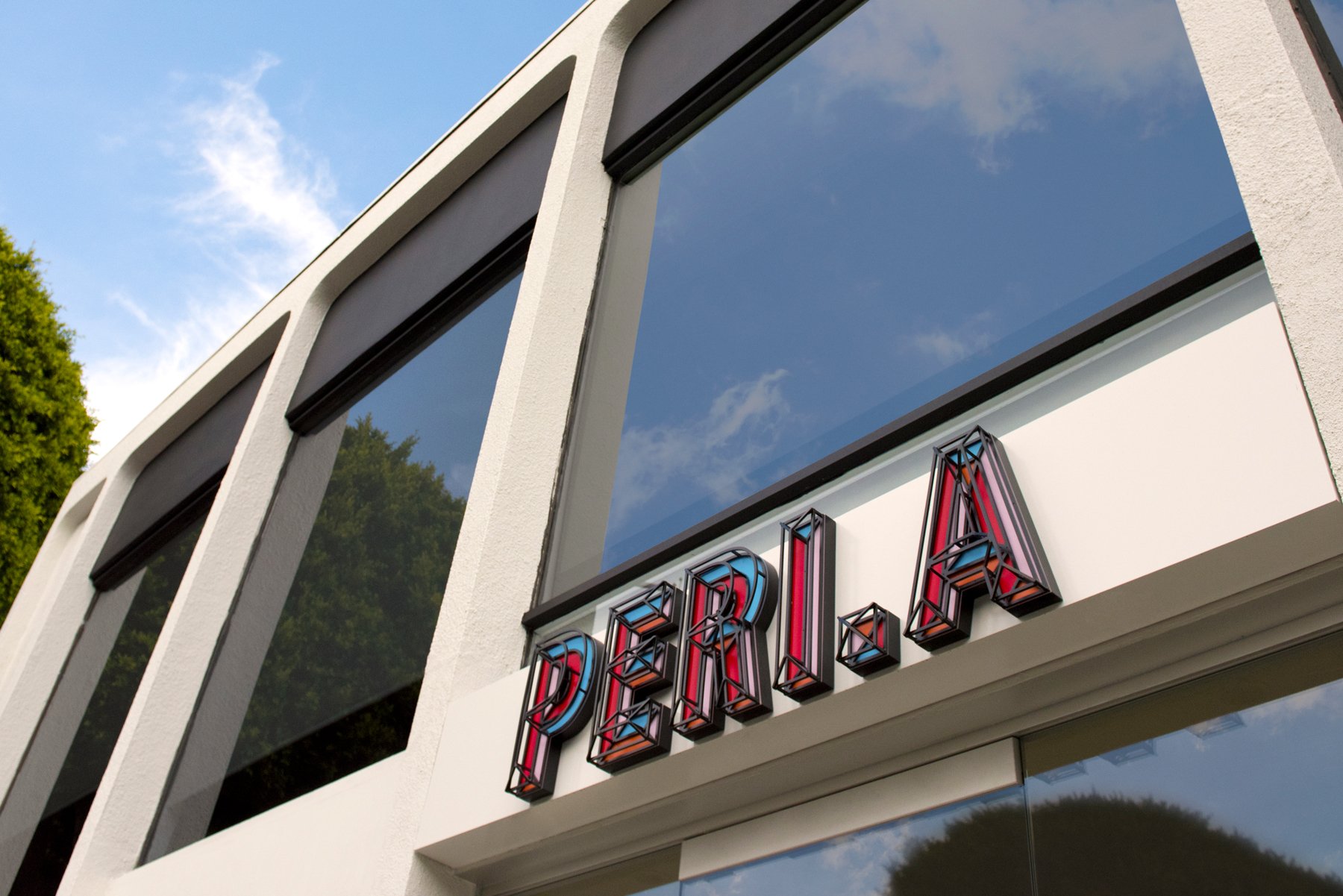
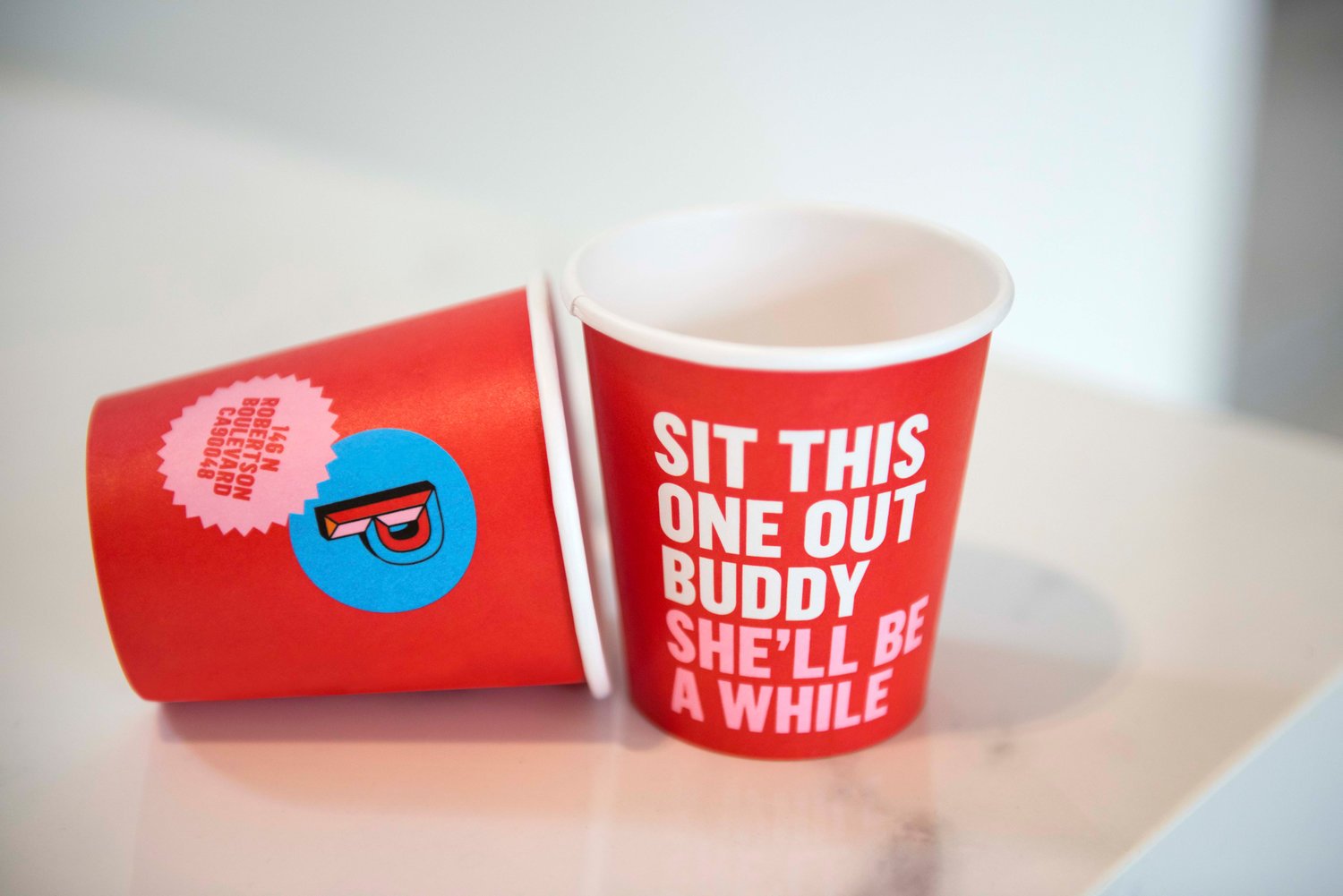
PERI.A
Agency: LOVE
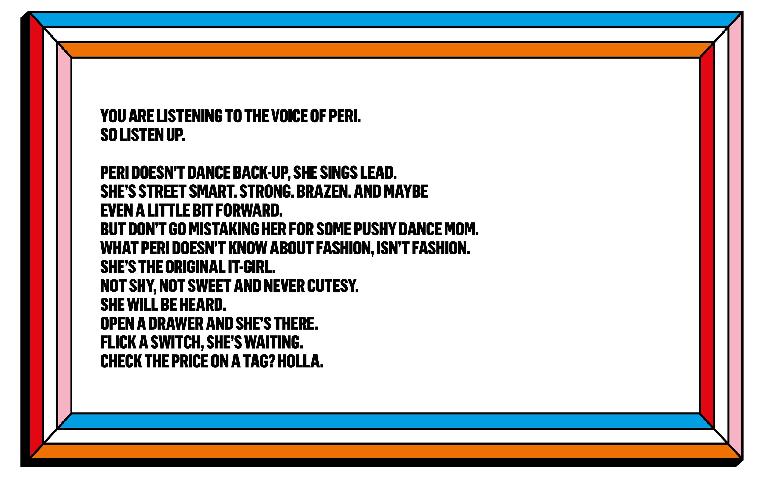
After a friendly tip off in a Beverly Hills hair salon, the story goes that LA socialite, Peri Arenas, dialled across the pond in search of someone to brand the shit out of her new fashion business. And boy, did she mean business.
Peri wanted to front it all, ultimately looking for someone to capture her sass-tastic taste and personality in every pixel of the PERI.A brand.
Taking cues directly from the playful fashion labels she loves, and throwing her straight-talking style into the mix, the PERI.A. brand was born. The result – a brash identity dripping with attitude, and a tone of voice that cuts through the bull.


Credits
Design: Tess Sweeney
Copywriter: Ellen Ling
Account Management: Ines Rollason & Alice Holland
Production: Michaela De Rossi
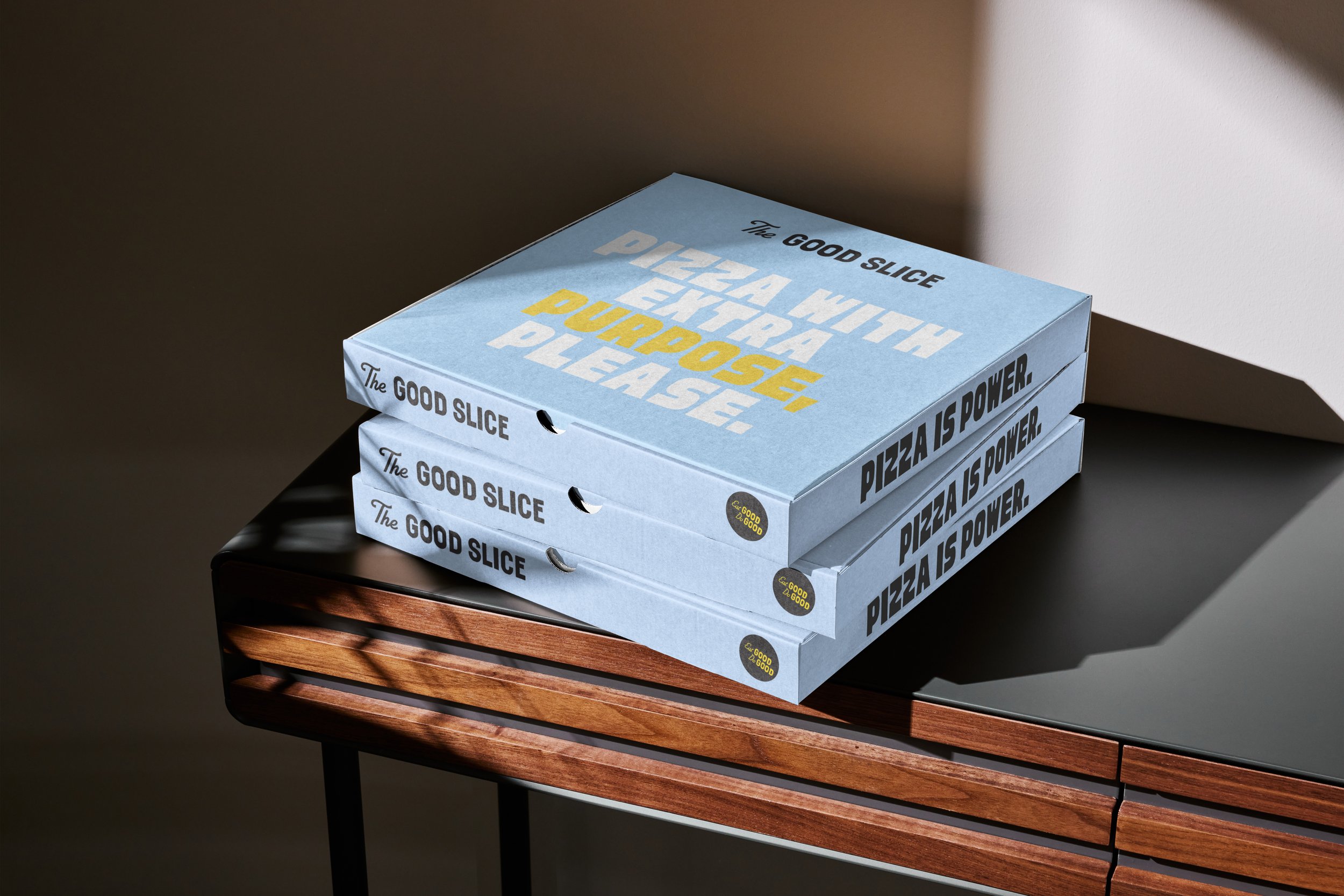
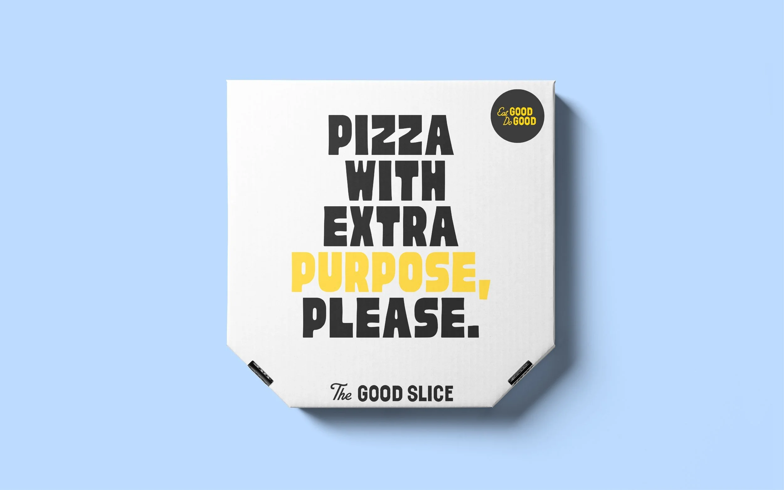
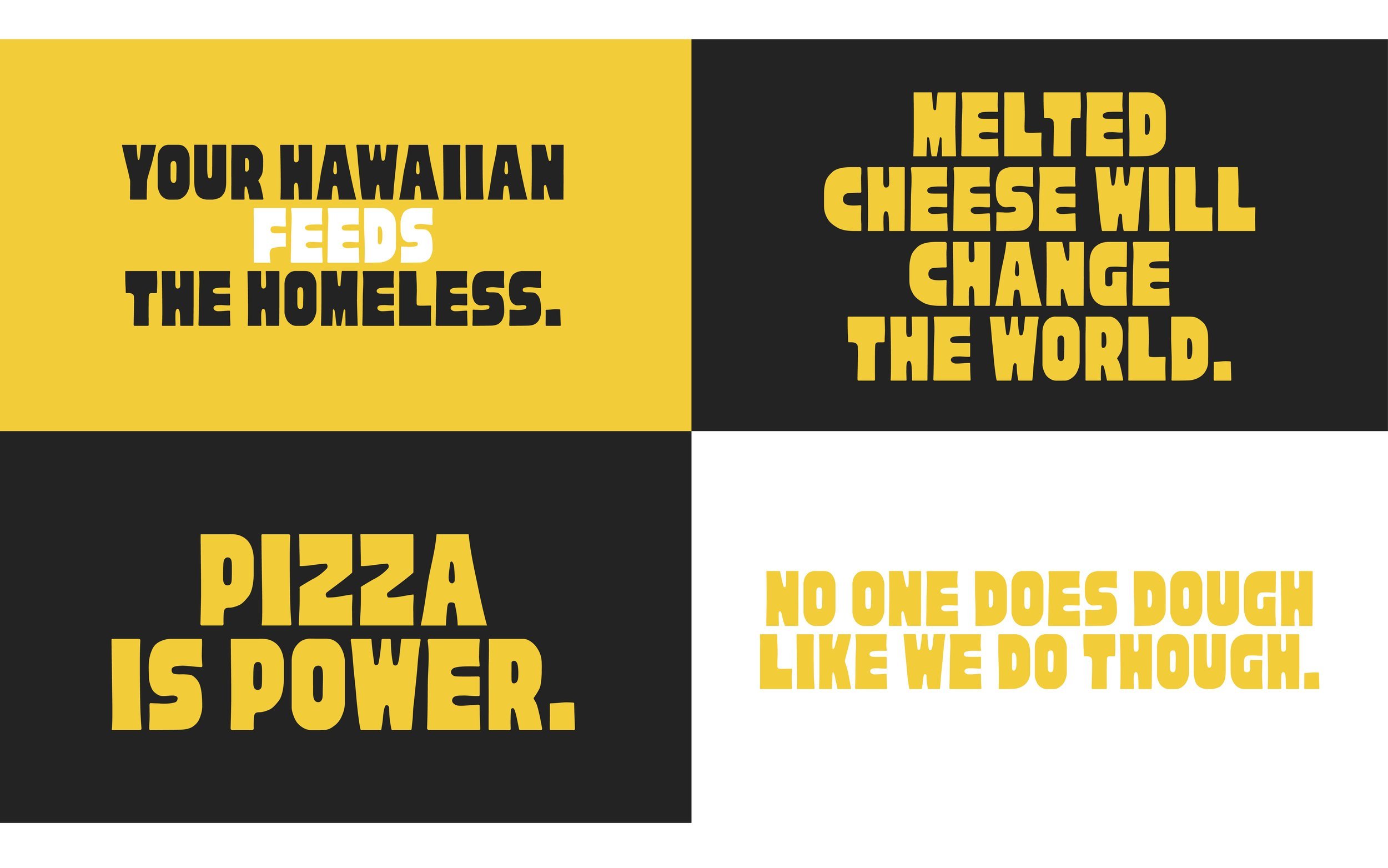
The Good Slice
Agency: Beginners Studio
The Good Slice put pizza to good use, firing up tasty slices for foodies and festival goers, while also putting meals on the table for those in need. Beginners Studio brought Lingo on board to craft a script that got new punters up to speed on the story so far.
As well as serving up punchy proposition lines for a social campaign, we also directed and managed the delivery of the VO for their brand film.
VO Script


Credits
Animation: Michael William Lester
Illustration: Gica Tam
Messaging & Script: Ellen Ling
VO Talent: Matt Duxbury

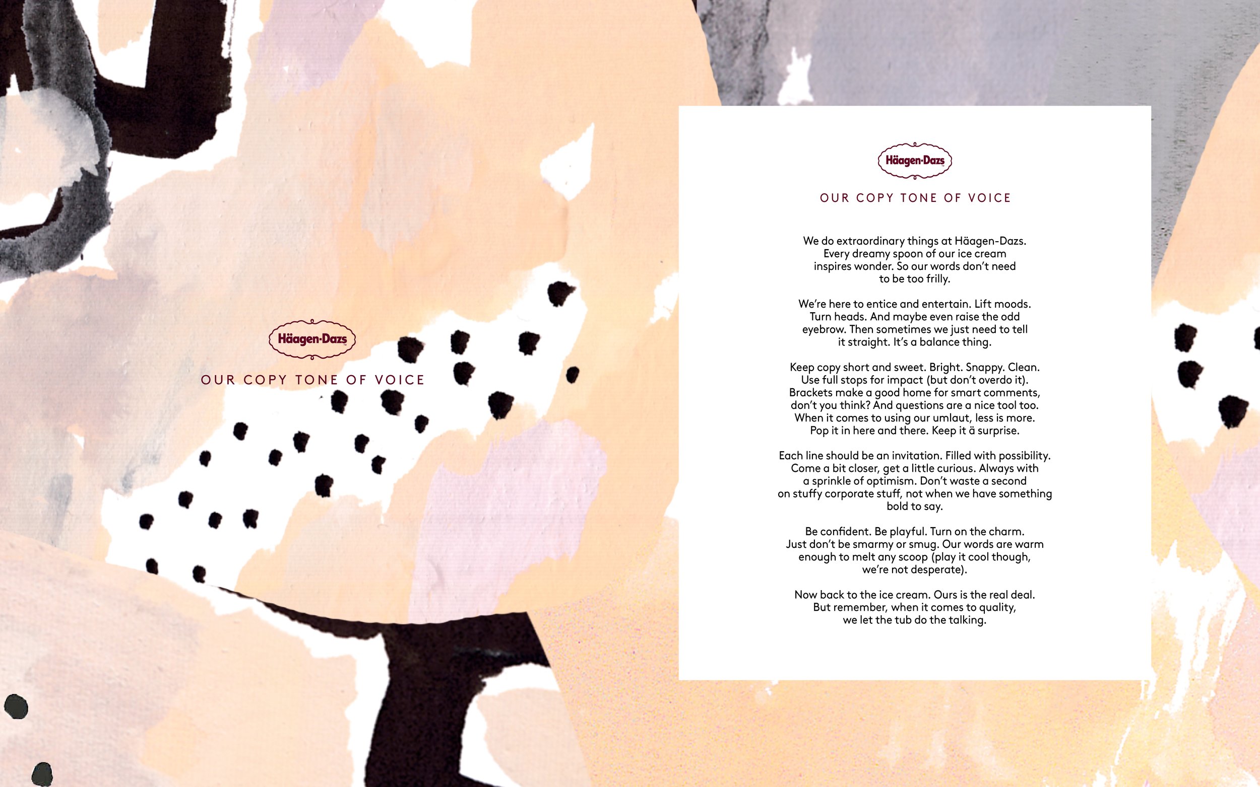
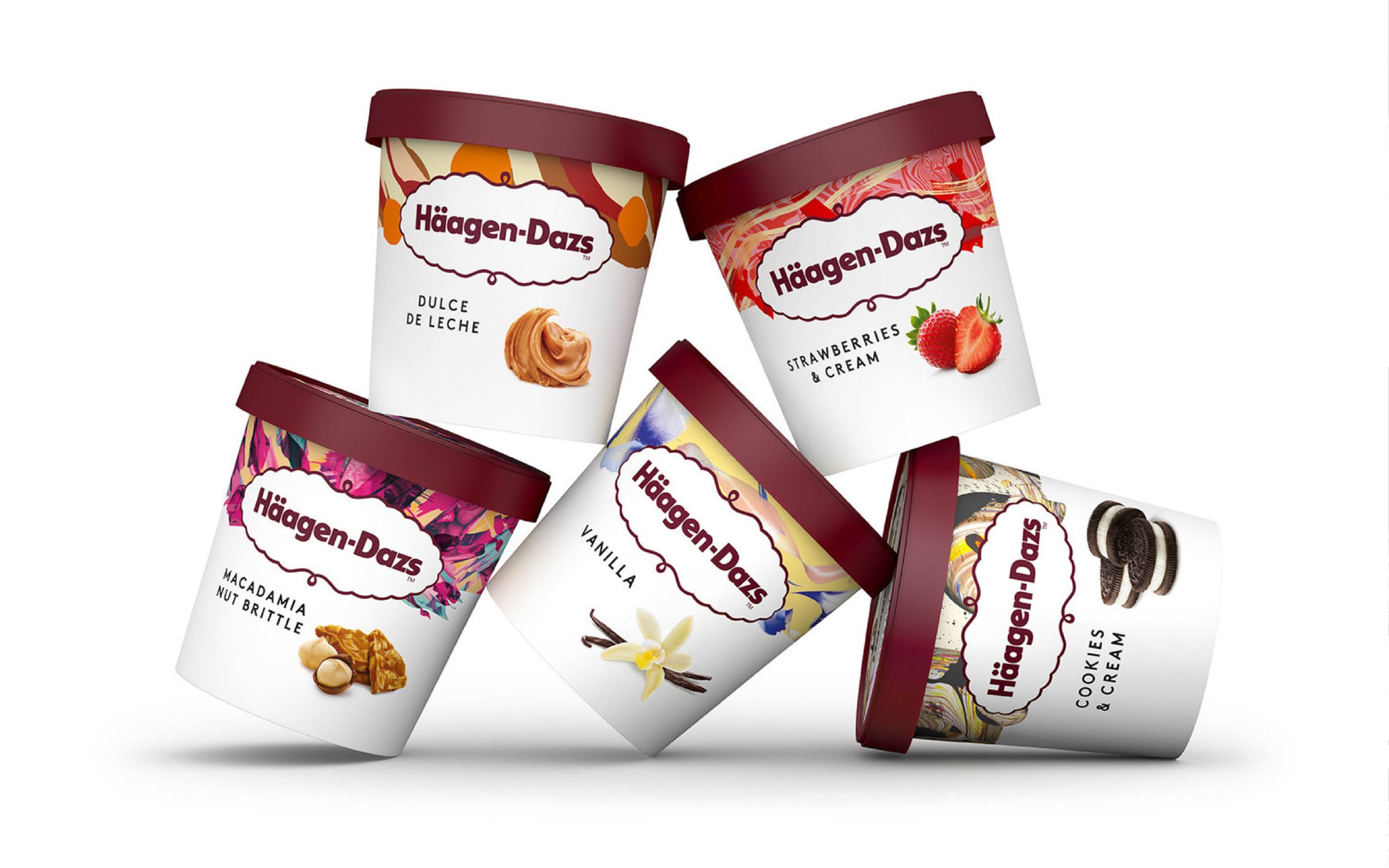
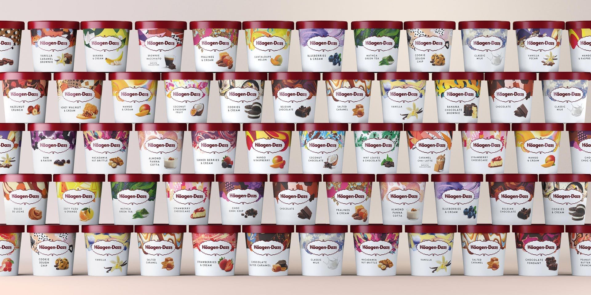
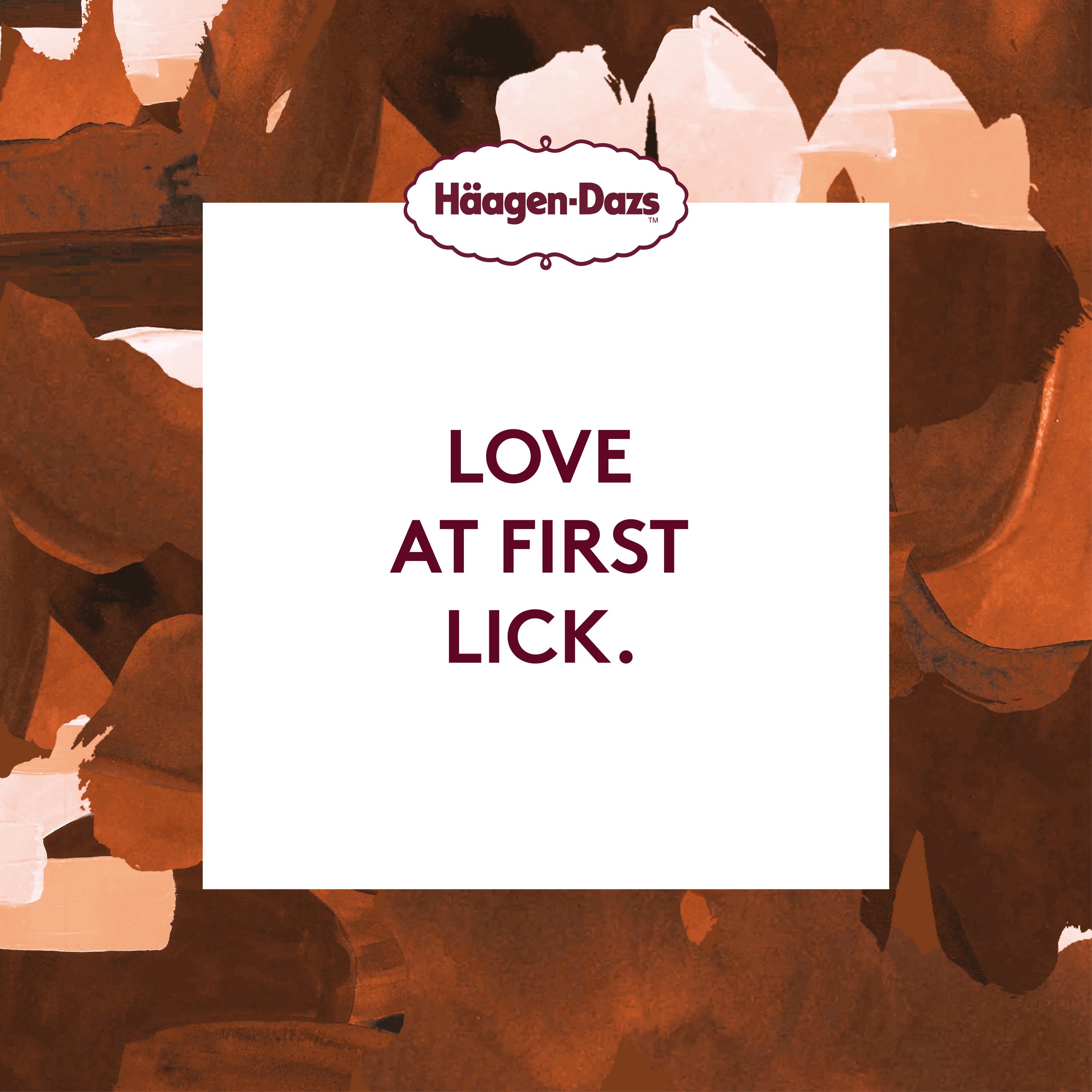
Häagen-Dazs – Brand Book
Agency: LOVE
After the gruelling task of tasting every flavour going, agency, LOVE. transformed Häagen-Dazs from an ageing icon being left on the shelf, into a wonder of packaging. And now they had a new do, it was time for a brand book that would help them scream about their ice cream worldwide.
As well as refreshing and redefining the global guidelines around copy, this feat of branding finally told the founders’ story, and brought brevity to a heavyweight that had become a design hodgepodge.


Credits
Design: Sam Wilkes, Harry Heptonstall & Leanne Watkinson
Copywriter: Ellen Ling
Account Management: Talli Palmer-Roberts & Holly Bee
Production: Helen Davies